

When a homeowner walks into a kitchen, the first thing they perceive isn’t the quality of the appliances or the square footage—it is the emotional temperature of the room. In my decade of hands-on interior design experience, I have always recommended my clients treat wood grain not as a flat surface, but as a living, breathing design layer.
In 2026, oak cabinetry is experiencing an incredible premium resurgence across the US. The challenge is no longer about hiding the prominent cathedral patterns of the wood, but rather selecting a surrounding palette that complements it. The real problem stems from using overly cool or muddy backdrops that clash with the natural undertones of timber, making a costly renovation feel dated.
To solve this, I utilize a repeatable balancing system based on tonal depth. Below, I break down 25 sophisticated Oak Kitchen Cabinet Color schemes to help you curate a space that feels entirely custom-tailored, current, and deeply welcoming.
| Style Profile | Target Oak Tone | Ideal Wall / Accent Color | Overall Mood |
| Organic Minimalist | White Oak / Cerused | Soft Alabaster, Warm Sand | Bright, airy, and calming |
| Earthy Transitional | Golden / Honey Oak | Sage Green, Muted Clay | Grounded, cozy, and natural |
| Architectural Drama | Fumed / Dark Oak | Charcoal, Warm Stone, Gold | Luxurious, bold, and high-end |
Tools & Materials You Need
Before you open a single can of paint or order your sample swatches, getting your exact technical specifications locked down is key to avoiding an undertone disaster:
Paint Sheen Standard: Matte or washable flat finishes for walls to create a soft, non-reflective counterweight to wood grains.
Bulb Temperature Target: Exact 3000K (Warm White) LED bulbs to prevent your oak from shifting into a harsh, undesirable yellow or green cast.
Hardware Scale: $6\text{“}$ to $8\text{“}$ oversized T-bar or cup pulls to ground the organic movement of the cabinet doors.
Grain Cut Specification: Quarter-sawn or rift-sawn oak cuts for a stable, linear pattern that feels inherently modern.
Detailed Step-by-Step Guide: 25 Oak Kitchen Cabinet Color Schemes
Light, Airy, and Modern Neutral Backdrops
1. Natural Oak with Soft White Walls
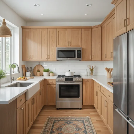
This classic pairing highlights the natural, linear beauty of the oak grain while keeping your entire culinary zone looking exceptionally bright and open. Soft white walls with a touch of warmth reflect incoming natural light beautifully, preventing the wood from feeling heavy. It is my absolute go-to formula for compact suburban kitchens.
2. Light Oak with Warm Beige Accents
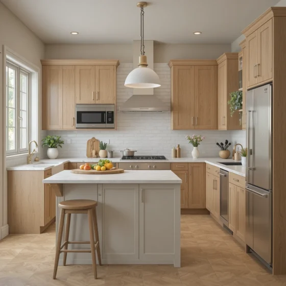
Pairing raw, light oak cabinets with subtle beige textiles or stone accents builds an incredibly soothing, low-contrast environment. This monochromatic approach layers similar values on top of one another, expanding the room’s boundary lines. It keeps the space looking architectural and cohesive rather than flat.
3. Honey Oak with Crisp White Countertops
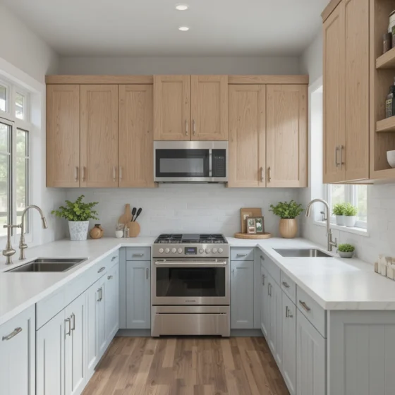
Honey oak carries a vibrant, joyful personality that can sometimes overwhelm a space if paired with the wrong materials. Introducing a thick, crisp white quartz countertop provides a stark, clean break that cools down the golden undertones. This combination updates classic cabinetry instantly.
4. Oak Cabinets with Sage Green Walls
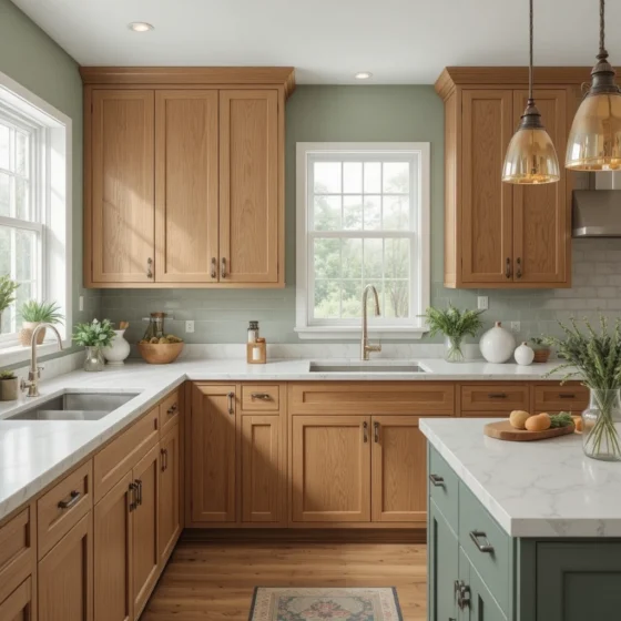
Sage green is an absolute front-runner for Oak Kitchen Cabinet Color pairings in 2026. The muted, desaturated green acts as a natural color complement to the orange-red spectrum found in natural timber. This organic combination brings a serene, wellness-focused energy into your home.
5. Whitewashed Oak with Soft Gray
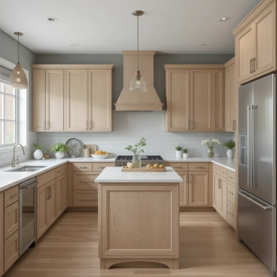
Whitewashed or cerused oak cabinetry feels crisp, clean, and highly Scandinavian when positioned against a soft, cool gray wall. This scheme keeps the wood grain visible while softening its overall intensity. It is highly suited for modern open layouts that value quiet elegance.
Muted Transitions and Earthy Character
6. Medium Oak with Creamy Off-White
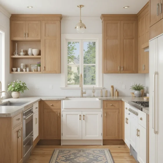
Creamy off-white wall paints offer a luxurious, velvety backdrop that softens the amber notes of medium oak. By steering clear of cold, blue-toned whites, you preserve the natural hospitality of the wood. This palette is incredibly effective for large, traditional family gathering spaces.
7. Oak Cabinets with Warm Taupe Walls
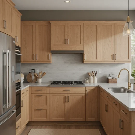
Warm taupe carries a beautiful balance of gray and brown, giving it enough weight to stand up to substantial oak graining. This grounded look creates an inviting envelope around your workspaces. It pairs exceptionally well with brushed brass or unlacquered gold hardware.
8. Dark Oak with Light Neutral Backdrop
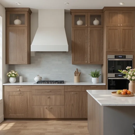
Fumed or dark-stained oak cabinetry demands a high-contrast environment to show off its rich architectural lines. Placing these dark units against a pristine, light alabaster wall gives the kitchen an immediate sense of scale and luxury. This keeps the layout from feeling dark or boxed-in.
9. Oak Cabinets with Soft Blue-Gray Walls
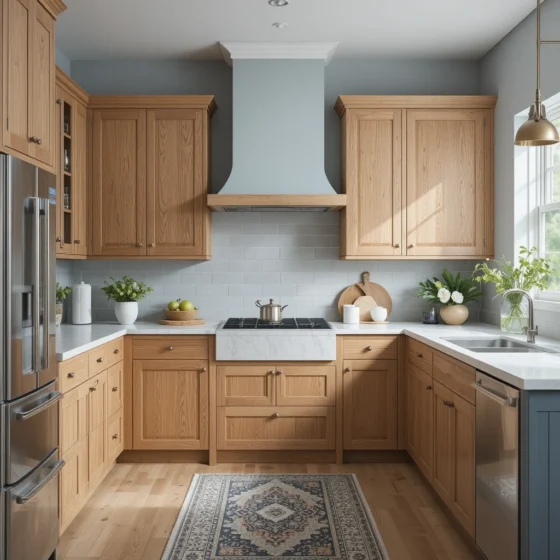
If you want to inject actual color into your kitchen without making it feel loud, a soft blue-gray wall is a gorgeous option. The cool undertones of the blue contrast gently with the warm fibers of the wood, establishing a highly balanced, sophisticated atmosphere.
10. Natural Oak with Matte Black Accents
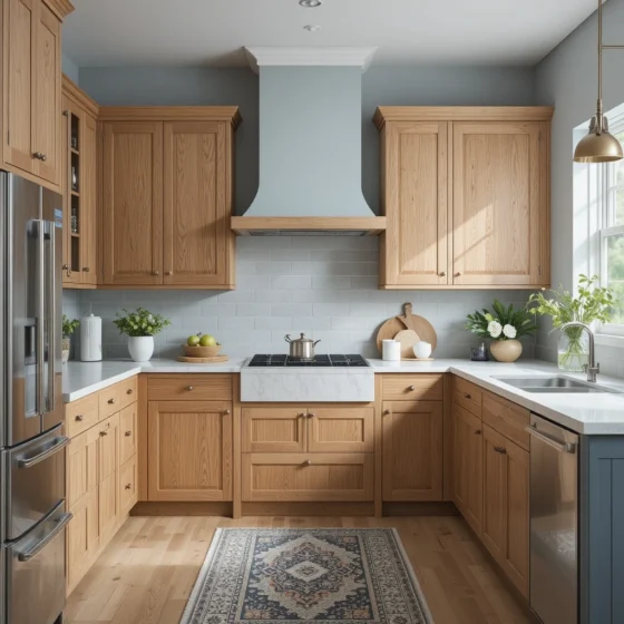
Introduce structural, graphic contrast to your light natural oak cabinets by utilizing matte black light fixtures, plumbing hardware, and counter stools. This unexpected frame detail gives the organic wood a sharp, confident edge, making it feel perfectly suited for urban architecture.
Versatile Mid-Tones and Tactile Variations
11. Oak Cabinets with Greige Walls
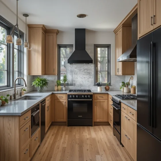
Greige bridges the gap between clean minimalism and organic comfort perfectly. This chameleon shade shifts subtly throughout the day as your natural lighting changes, consistently pulling out the best undertones of your selected Oak Kitchen Cabinet Color without ever looking dated.
12. Oak Cabinets with Soft Clay Tones
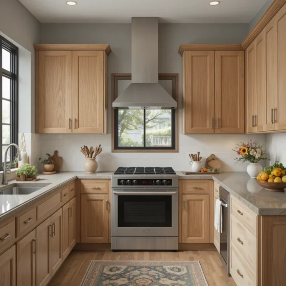
Terracotta and soft clay plaster finishes bring a beautiful, old-world warmth into a modern kitchen layout. When applied behind raw oak open shelving, clay colors build a deeply tactile, Mediterranean-inspired workspace that feels grounding and artistic.
13. Light Oak with Pale Green Undertones
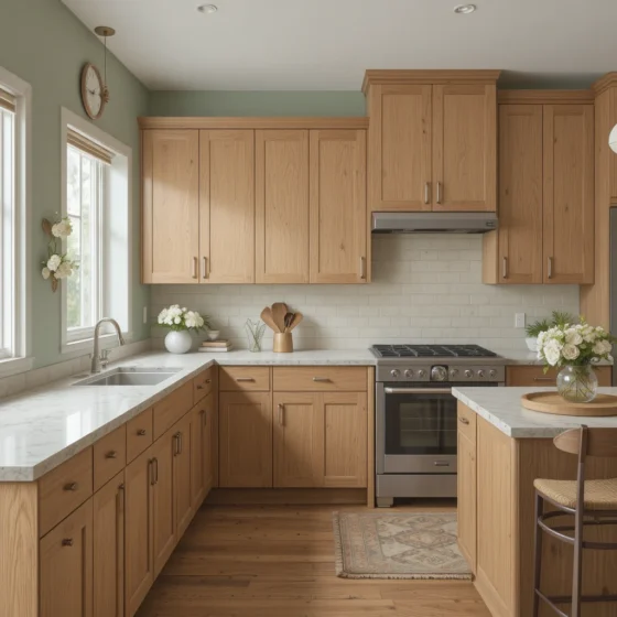
Pale, minty green walls introduce a whisper of fresh color that honors the natural origins of your cabinetry. This gentle color interaction behaves like a soft neutral, making your food prep stations feel bright, light, and focused entirely on home wellness.
14. Oak Cabinets with Warm Charcoal Accents
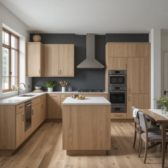
For homeowners who love a moody look but want to avoid a completely dark kitchen, try dressing your central island or a single accent wall in rich charcoal. Leaving the primary perimeter cabinets in a natural oak finish keeps the layout visually balanced, grounded, and expensive.
15. Oak Cabinets with Ivory and Linen Tones
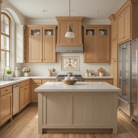
Layering soft ivory paints, textured linen Roman shades, and cream backsplashes creates an incredibly rich, tactile environment. This classic pairing dials back the intensity of the wood grain, resulting in an approachable, traditional American style.
Rich Elements and Trend-Forward Conceptions
16. Rustic Oak with Earthy Brown Walls
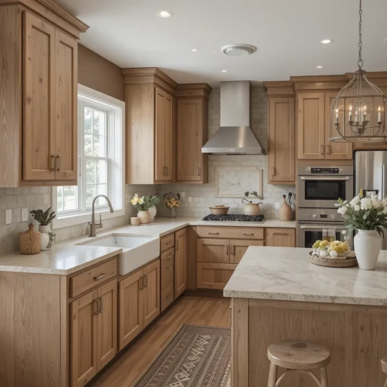
If your home leans toward a cozy mountain lodge or an authentic farmhouse style, lean entirely into the warmth. Pairing heavily knotted rustic oak with rich, chocolatey brown accent walls creates a deeply sheltering, historical aesthetic that prioritizes comfort.
17. Oak Cabinets with Soft Blush Accents
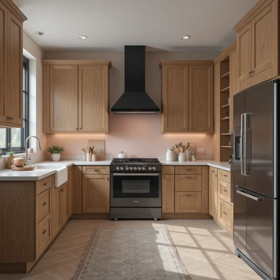
Soft blush pink acts as an incredibly chic, modern neutral when paired alongside light oak wood. The pink undertones bring out the delicate, pale red lines hidden within the oak’s fiber structure, creating a fresh, highly custom look for design-conscious spaces.
18. Oak Cabinets with Muted Terracotta
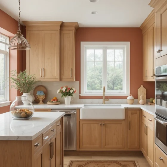
Muted terracotta brings a rich, sun-baked energy directly into the heart of the home. This highly trend-forward pairing works beautifully with golden oak variants, emphasizing the wood’s depth while establishing an inviting backdrop for evening dinner parties.
19. Oak Cabinets with Warm White and Gold Details
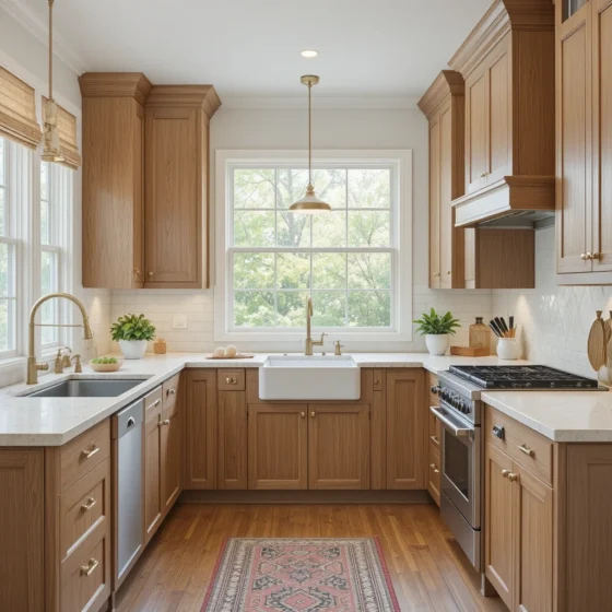
Elevate your cabinetry by painting the surrounding plaster a clean, warm white and dressing the doors in heavy, polished gold hardware. This jewelry-like metal choice catches overhead task lighting perfectly, adding a layer of formal luxury to the wood.
20. Oak Cabinets with Dusty Blue Walls
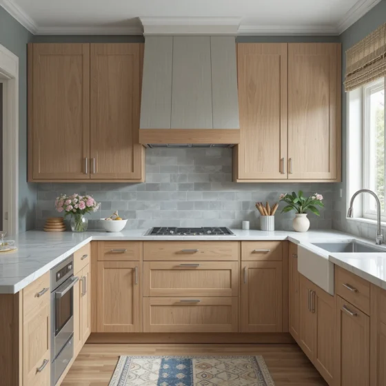
Dusty blue delivers an incredible, relaxing contrast when placed side-by-side with honey-toned cabinets. Because blue and orange sit opposite one another on the color wheel, this pairing naturally creates visual harmony, making the space feel relaxed yet highly curated.
Tailored Finishes and Structured Layouts
21. Oak Cabinets with Soft Mushroom Gray
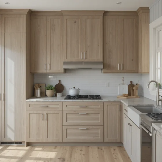
Mushroom gray contains deep earthy brown undertones, making it a highly successful pairing for modern transitional layouts. It adds a beautiful, quiet depth to the walls while letting the natural movement of your oak cabinetry remain the true hero of the design.
22. Oak Cabinets with Cream and Soft Brown Layers
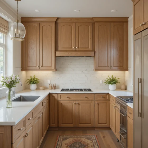
Building a gradient palette using creams, soft tawnys, and espresso details integrates your cabinets into the room’s architecture. Rather than making the wood look like a standalone feature, this layering system makes the entire kitchen look custom-built.
23. Oak Cabinets with Neutral Two-Tone Scheme
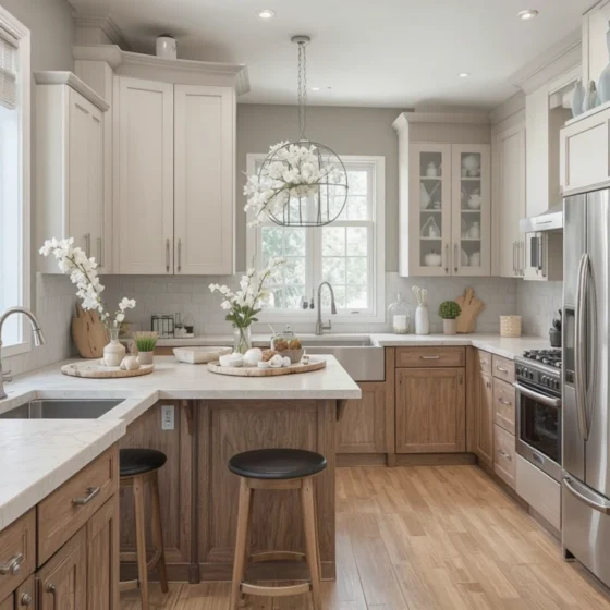
A major layout trend for 2026 is the mixed-material approach. Specify rich oak for your heavy lower drawers and kitchen island bases to root the room, then use a light sand or pale putty shade for the upper wall cabinets to maximize your spatial light.
24. Oak Cabinets with Warm Stone Shades
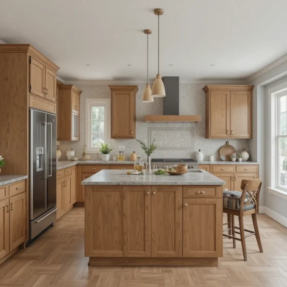
Draw design inspiration directly from nature by pairing your cabinets with stone-inspired wall textures, such as limestone or soft travertine shades. This color interaction feels organic, high-end, and perfectly aligned with timeless architectural design.
25. Oak Cabinets with Soft Sand and Beige Blend
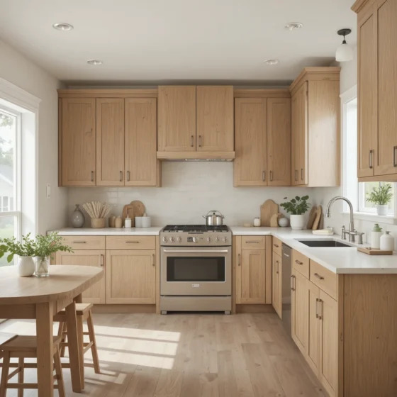
Cultivate a calm, coastal-inspired retreat by washing your walls in a soft, sun-bleached sand shade. When paired with light white-oak cabinetry, this blend creates an incredibly bright environment that makes your daily routine feel like a quiet escape.
Optical Tricks & Pro Styling Hacks
When you are choreographing a color scheme around prominent wood grains, you can use these professional tricks to balance the room’s proportions:
The Grain Continuity Trick: When detailing full-height pantry doors, ensure your cabinet maker runs the oak grain completely vertically. This continuous line pulls the eye upward toward the ceiling, making low-ceilinged kitchens feel instantly grander.
The High-Contrast Island: If you are worried that an all-oak room will look too monotonous, paint your central island base a contrasting tone like deep charcoal or sage green while keeping the perimeter cabinets wood. This breaks up the floor space beautifully.
Hide the Bulkheads: Paint any upper wall soffits or bulkheads the exact same color as your wall paint, rather than matching them to the cabinets. This keeps the upper perimeter looking streamlined and prevents the wood from looking blocky.
Scientific Data & Spatial Psychology Parameters
The integration of natural wood elements within our daily spaces has a profound, measurable impact on our biological well-being. According to data from environmental psychology and interior physics:
The Neurological Value of Biophilia: Human beings process the natural geometric patterns found in wood grain—known scientifically as statistical fractals—with incredible ease. Visual data shows that entering a kitchen that balances organic timber elements with soothing earth tones drops heart rate variability and significantly lowers cortisol production compared to stepping into an all-white synthetic laminate space.
Furthermore, solid wood finishes function as excellent acoustic dampeners, softening high-frequency kitchen noises to create a calmer environment during busy family meal prep times.
Frequently Asked Questions (FAQ)
What metal hardware finishes look best on modern oak cabinets?
Matte black offers a sharp, contemporary graphic contrast, while brushed brass or unlacquered gold hardware adds an upscale, warm sophistication. For a softer look, brushed nickel integrates seamlessly into cool palettes.
How do I prevent my oak kitchen cabinets from looking yellow or orange?
Avoid cool, blue-tinted white wall paints, which will accidentally emphasize the warm orange undertones of the wood. Instead, stick to warm neutrals like creams, greiges, or soft sage greens, and use 3000K lighting.
Can I mix oak cabinets with painted cabinets in the same kitchen?
Yes, absolutely. The two-tone approach is highly successful. I always recommend placing the textured oak cabinets on the lower bases or the center island to anchor the space, while using a light neutral paint for upper units.
Final thoughts
Your kitchen cabinetry is much more than simple everyday storage—it is the material anchor that dictates the entire mood of your home. These 25 forward-thinking color strategies prove that oak is an incredibly versatile canvas, fully capable of shifting between airy minimalism, rich history, and bold modern luxury.
By surrounding your wood elements with the right paint tones, clean stone countertops, and deliberate metallic hardware, you can easily create a balanced culinary haven that will stand the test of time.
Trust the authenticity of natural materials, lean into warm, supportive color pairings, and enjoy your beautiful, timeless sanctuary for decades to come.