

When the morning air turns crisp and the light shifts to a softer, golden hue, my designer brain immediately starts itching for color swatches. Over my decade of running a residential interior design studio, I have learned that capturing the spirit of autumn inside your home goes far beyond throwing a few bright orange plastic pumpkins on a counter. A truly sophisticated Fall color palette relies on depth, texture, and unexpected undertones that mimic the real, organic transition happening outside our doors.
Whether you love understated, sun-washed neutrals or crave dramatic, moody jewel tones, shifting your home’s mood for the season is one of the most rewarding styling projects you can undertake. I often tell my clients that color isn’t just visual—it completely alters how a space feels physically and emotionally. Below, I have pulled together my ultimate, field-tested list of 18 distinctive palette combinations, complete with exact styling directions so you can curate your space like a seasoned pro Fall color palette.
Quick Reference Palette Summary
Essential Styling Prerequisites
Before diving into paint pans or buying new textiles for your fall color palette, I always instruct my clients to collect a foundational toolkit to ensure color accuracy across different lighting conditions:
Physical Paint Swatches: Always test samples on poster boards rather than painting directly on existing walls.
Fabric Swatches: Collect linen, velvet, and wool samples to see how light absorbs into different surface textures.
Temperature-Corrected Lighting: Standard 2700K LED bulbs mimic golden hour, whereas 4000K bulbs will wash out subtle earth tones.
Natural Elements: Keep a handful of dried oak leaves, raw acorns, or unpainted ceramic tiles nearby to test your accent colors against true natural materials.
18 Expert-Approved Fall Color Palette Combinations
1. Terracotta & Muted Sage
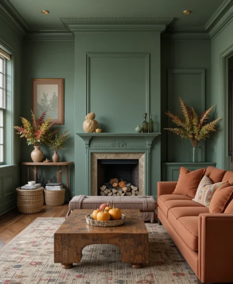
This pairing roots your room in deep, baked-earth clay while balancing the warmth with a cool, botanical green. In my own living room, I love pairing sun-drenched terracotta pillows against a backdrop of muted sage walls because it feels instantly grounded without overpowering small spaces. The contrast works beautifully under natural daylight, creating a calm, sanctuary-like environment that feels both rustic and modern.
2. Spiced Pumpkin & Buttery Cream
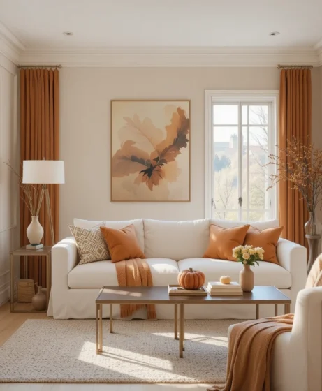
Forget harsh, synthetic oranges—this elevated fall color palette relies on soft, roasted pumpkin tones anchored by rich, buttery creams. I always recommend using pumpkin as a low-lying accent, such as a hand-thrown ceramic vase or a chunky knit throw over a cream slipcovered sofa. The creamy foundation keeps the space airy, preventing the vibrant orange tones from overwhelming your sightlines.
3. Golden Mustard & Deep Charcoal
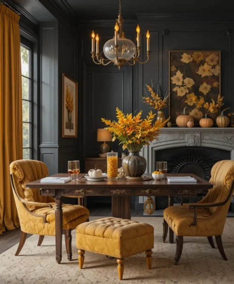
If you lean toward contemporary design, combining saturated mustard yellow with rich, moody charcoal provides incredible visual weight and drama. The charcoal acts as a dark anchor that allows the golden yellow to sing without looking like a seasonal cliché. I frequently use this combination in home offices or formal dining rooms to foster a sense of focused, modern sophistication.
4. Burnt Sienna & Antiqued Brass
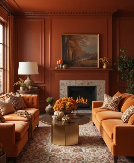
There is an inherent luxury to pairing burnt sienna velvet with the warm, reflective sheen of aged brass hardware and light fixtures. The fiery reddish-brown tones of sienna reflect softly against metallic surfaces, casting a golden glow throughout the room during late afternoon light. It’s an ideal palette for living rooms where cozy evening entertaining is the main priority.
5. Deep Crimson & Warm Walnut Wood
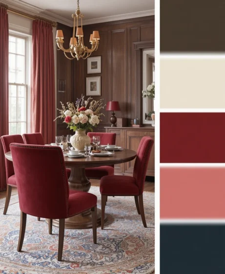
Deep crimson brings a classic, heritage feel to a space when paired alongside the dark, rich grain of natural walnut furniture. I love using crimson in velvet dining chairs or heavy drapery where light can catch the richness of the weave. The deep wood tones tame the red, keeping it sophisticated, timeless, and completely free of artificial intensity.
6. Moody Plum & Soft Antique Gold
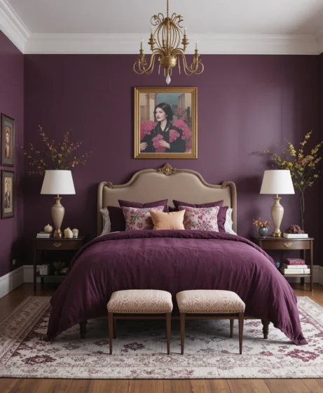
Plum is the unsung hero of the modern fall color palette, offering a subtle purple undertone that feels deeply autumnal yet entirely fresh. When paired with muted antique gold accessories, such as vintage picture frames or candlestick holders, the plum backdrop transforms a simple bedroom into a royal retreat. It’s a high-drama pairing that thrives under dim evening lamplight.
7. Warm Amber & Muted Olive Green
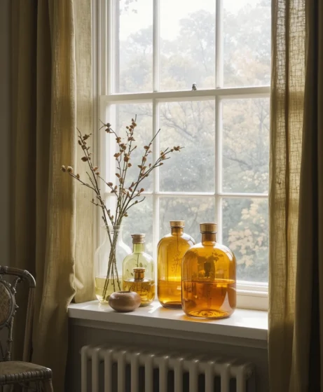
Reminiscent of a quiet walk through a fading forest, warm amber and muted olive evoke a sense of nostalgic, mid-century charm. I like to layer olive green linen drapes over warm amber glass decor pieces on a windowsill so the sunlight filters through in rich, golden waves. This combination brings the outdoors inside with a gentle, organic rhythm.
8. Ground Cinnamon & Soft Oatmeal
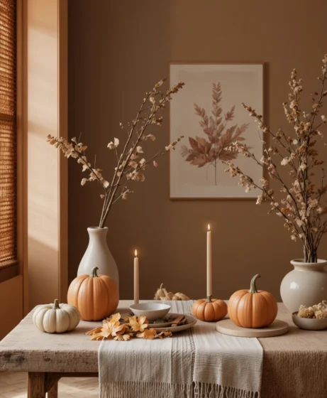
For minimalists who want a quiet nod to the season, ground cinnamon layered over a base of soft oatmeal linen is absolute perfection. The beauty of this pairing lies entirely in tactile variation—think chunky wool blankets, raw linen table runners, and matte ceramics. It creates a serene, low-contrast haven that feels exceptionally cozy without introducing loud colors.
9. Midnight Navy & Vibrant Rust
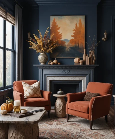
Navy blue acts as a powerful neutral, providing a dramatic backdrop that makes vibrant rust accents pop with unexpected warmth. I often style a midnight navy feature wall with rust-colored suede accent chairs to create high visual interest and depth. The tension between the cool blue and warm rust creates a dynamic energy in living rooms.
10. Metallic Copper & Pale Greige
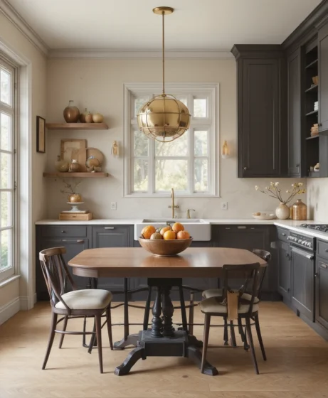
Greige provides a clean, modern canvas, while metallic copper accents introduce a shimmering warmth that feels cozy yet light. I prefer using raw, brushed copper bowls or light fixtures against matte greige walls to keep the metallic elements from feeling overly glossy. This palette works exceptionally well in modern kitchens and open-concept dining areas.
11. Deep Forest Green & Golden Caramel
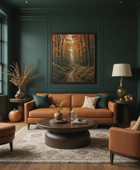
Transport your home straight into a dense autumn woodland by combining deep forest green with golden caramel leather. A dark green room featuring a caramel leather sofa is one of my all-time favorite interior design combinations because it feels rich, handsome, and endlessly inviting. The warm leather instantly softens the cool, receded nature of the green walls.
12. Dusty Rose & Golden Ochre
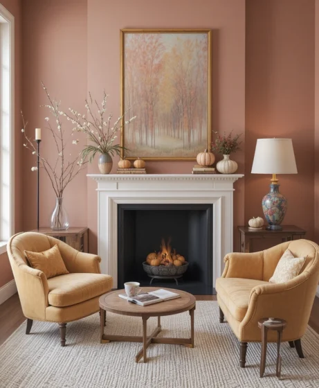
For a soft, vintage romantic take on the season, dusty rose paired with golden ochre offers a surprising depth that feels artistic and refined. The secret here is ensuring both colors share a muted, earthy undertone so neither feels overly bright or juvenile. I love using this color story in guest bedrooms or quiet reading nooks.
13. Dark Espresso & Fiery Rust
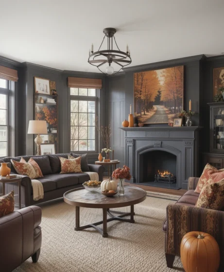
Channel the dramatic architecture of late autumn by layering dark espresso wood and paint with fiery rust accents. The near-black richness of espresso absorbs light, creating a moody envelopment, while rust cushions or art pieces inject vital warmth and energy. It’s a bold choice that works wonders in smaller, intimate spaces like dens or powder rooms.
14. Dried Wheat & Warm Alabaster
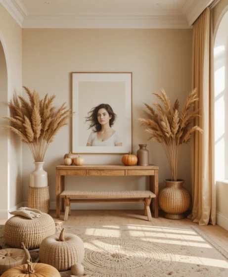
If your aesthetic leans Scandinavian or Japandi, a palette built on dried wheat tones and warm alabaster white will instantly elevate your space. Focus on organic textures like pampas grass, woven rattan baskets, and light-toned woods set against creamy alabaster walls. This low-contrast approach reflects light beautifully while maintaining a cozy, autumnal atmosphere.
15. Wine Burgundy & Rich Camel
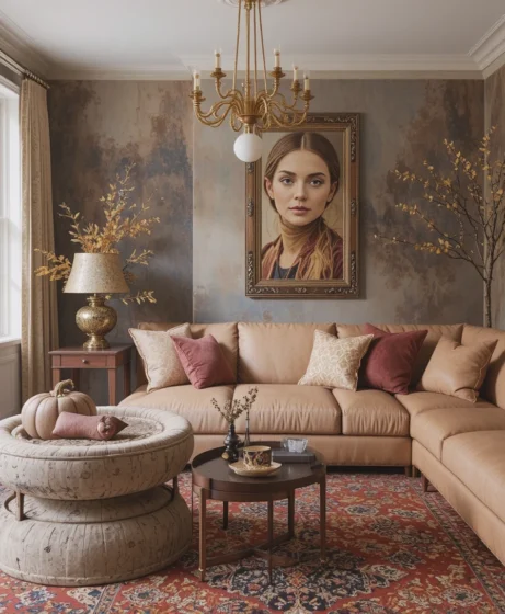
Burgundy paired with rich camel leather exudes polished, tailored luxury reminiscent of a high-end autumn wardrobe. I recommend using camel as the dominant neutral on larger furniture pieces and layering burgundy through accent rugs, velvet pillows, or original artwork. The combination feels smart, cozy, and effortlessly elevated.
16. Warm Clay & Cool Slate Grey
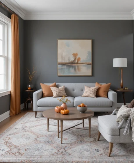
Balancing the fire of warm clay with the soothing neutrality of cool slate grey creates a beautifully harmonious room balance. The cool grey prevents the warm clay tones from feeling too heavy or overwhelming in bright rooms. I often apply clay on accent ceramics while keeping large upholstered pieces in crisp, slate-grey wool.
17. Bright Persimmon & Light Birch
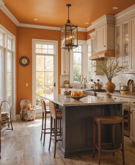
Inject a burst of cheerful, sunlit energy into your autumn home by pairing bright persimmon orange with light birch wood tones. Persimmon brings an energetic spark that feels fresh, while the clean, pale wood grain keeps the look grounded and contemporary. It’s a fantastic choice for bright, sunny kitchens and casual breakfast nooks.
18. Roasted Chestnut & Off-White Bone
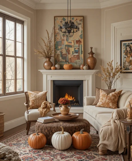
Embrace heritage warmth with a deeply satisfying pairing of roasted chestnut brown and off-white bone tones. This palette leans heavily on rich, nostalgic woods and creamy stoneware ceramics that feel like they have been passed down through generations. It creates an inviting atmosphere that practically begs you to curl up with a hot drink.
Spatial & Optical Styling Hacks for Autumn
When implementing any fall color palette, color placement dictates how large or small your space will feel:
The 60-30-10 Rule: Dedicate 60% of the room to your main neutral (e.g., Alabaster or Oat), 30% to your secondary tone (e.g., Muted Olive or Sage), and 10% to your vivid fall accent (e.g., Burnt Sienna or Persimmon).
Receding Wall Trick: Dark colors like Forest Green or Midnight Navy absorb light and visually recede, making small rooms actually feel larger and more expansive at night.
Reflective Warmth: Position warm metallic accents like copper or brass directly opposite north-facing windows to bounce golden natural light deep into grey, shadowed corners.
Color Psychology & Physics Data
Decorating for autumn isn’t just an aesthetic impulse—it’s driven by environmental biology and visual psychology:
Scientific Insight: Research in spatial color psychology indicates that warmer color wavelengths (specifically red, orange, and golden-yellow hues) stimulate the sympathetic nervous system, slightly increasing perceived room temperature by up to 2 degrees Fahrenheit in occupant self-assessments. Furthermore, warm earth tones increase feelings of social warmth and security during periods when external daylight hours rapidly decrease.
Frequently Asked Questions
How can I update my home’s palette for fall on a budget?
Focus on high-impact swap-outs rather than painting walls. Swap summer pillow covers for velvet or wool textures in your chosen fall color palette, introduce dried botanical stems to existing vases, and layer warm-toned throw blankets over your main seating areas.
What is the most timeless fall color palette for small spaces?
A base of warm alabaster or soft oatmeal paired with muted sage green and subtle terracotta accents is virtually foolproof. Light base shades maximize spatial perception, while subtle clay accents introduce warmth without visual clutter.
How do I transition my summer decor into autumn smoothly?
Begin by swapping out lightweight cottons and linens for heavier weaves like boucle, tweed, and velvet. Keep your foundational neutral furniture intact while systematically replacing cool-toned blue or pink accents with warmer earth tones like cinnamon, ochre, and rust.
Final Thoughts
Curating a cozy, inviting home for autumn isn’t about following fleeting trends—it’s about building a warm sanctuary that reflects your personal rhythm.
By experimenting with unexpected color pairings, leaning into rich tactile materials, and thoughtfully balancing light and shade, you can craft a space that feels deeply restorative all season long.
Pick a palette that resonates with how you want to feel, trust your design instincts, and enjoy the cozy process of layering your home for fall.
