

Selecting a paint color that balances distinct personality with quiet relaxation is one of the most rewarding parts of my work. Throughout my decade of hands-on interior design experience, I have always guided my clients to look beyond standard whites or overly predictable grays when trying to cultivate a restorative sanctuary.
In 2026, Mauve Paint Colors have emerged as a definitive design choice across the United States for homeowners looking to inject soft elegance and romantic warmth into their living spaces. This complex color family blends purple sophistication, pink warmth, and a heavy dose of gray grounding tones, making it incredibly adaptable to modern lifestyles. The primary challenge I observe with DIY executions is failing to account for how shifting light conditions can cause these complex undertones to pull overly muddy or intensely pastel.
To solve this, I rely on a repeatable styling system that balances paint formulas with proper lighting temperatures and contrasting textile layers, ensuring your room looks intentional, expensive, and beautifully tailored. Below are 10 exceptional paint choices alongside professional design ideas to transform your home.
| Paint Shade | Core Undertone Blend | Best Spatial Target | Intended Spatial Mood |
| Mauve Finery | Light Pastel Purple-Pink | Bedrooms, nurseries, closets | Dreamy, airy, soft, and soothing |
| Ash Violet | Deep Dusty Gray-Purple | Living rooms, textured accents | Grounded, cozy, sophisticated, and warm |
| Veiled Violet | High-Gray Smoky Lavender | Media rooms, focal fireplaces | Sleek, modern, balanced, and calm |
| Plummy | Saturated Deep Plum-Gray | Reading nooks, vanity powder rooms | Dramatic, luxurious, intimate, and moody |
Tools & Materials You Need
Before you crack open your paint cans or apply protective tape to your baseboards, establishing these technical parameters ensures a flawless, high-end application:
Paint Formula Standard: Sherwin-Williams Emerald Interior Acrylic Latex in an Eggshell or Satin sheen for walls to resist scuffs while diffusing light.
Trim Contrast Paint: Sherwin-Williams Pure White (SW 7005) or Alabaster (SW 7008) in a Semi-Gloss finish to establish crisp, architectural borders.
Roller Cover Depth: A high-quality $3/8\text{“}$ microfiber roller nap to keep the paint application uniform and glass-smooth on standard residential drywall grids.
Lighting Temperature Window: Stick to energy-efficient LED light bulbs specified strictly between 2700K and 3000K to draw out the warm, romantic undertones without making the space look sterile.
Detailed Step-by-Step Guide: 10 Mauve Paint Color Ideas
Soft Transitions and Sophisticated Common Areas
1. Soft Mauve Bedroom Glow

Utilizing Sherwin-Williams: Mauve Finery sets up an incredibly peaceful, romantic foundation right inside your primary sleeping quarters. This specific formula features a delicate purple base lightened by soft pink notes, which keeps the vertical wall planes looking completely fresh and luminous. I always recommend my clients pair this ethereal background with crisp white linens and light ash furniture pieces to maintain an open, luxurious hotel feel.
2. Dusty Mauve Living Room
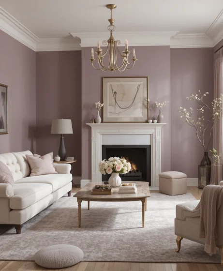
Sherwin-Williams: Ash Violet
When designing a gathering space that needs to feel warm yet current, Sherwin-Williams: Ash Violet is an absolute design favorite. The heavy smoky gray dust layer hidden inside this purple-pink matrix tames the color, transforming it into an upscale neutral. Frame your windows with long linen draperies, and introduce ivory bouclé sofas and unlacquered brass floor lamps to build a welcoming conversation circle.
3. Muted Mauve Office Space
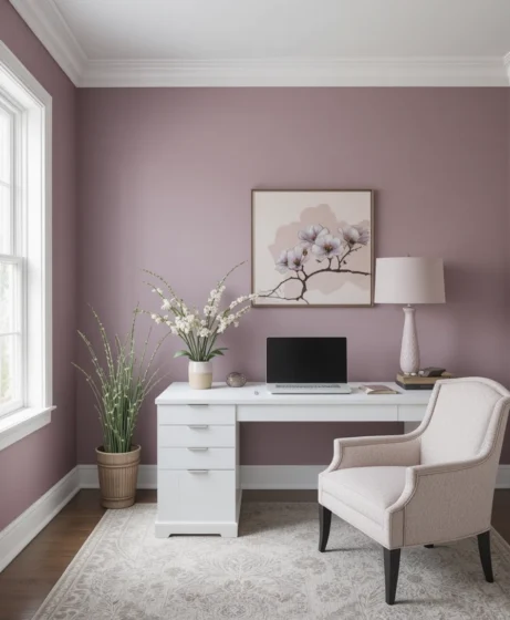
Sherwin-Williams: Plum Blossom
Home workspaces require a balanced backdrop that reduces visual fatigue while maintaining an elegant, creative energy. Sherwin-Williams: Plum Blossom injects a quiet, refined maturity onto your office walls that encourages daily focus. This shade forms a magnificent architectural frame around warm walnut desks, floating oak shelving units, and matte black office chairs.
4. Smoky Mauve Accent Wall
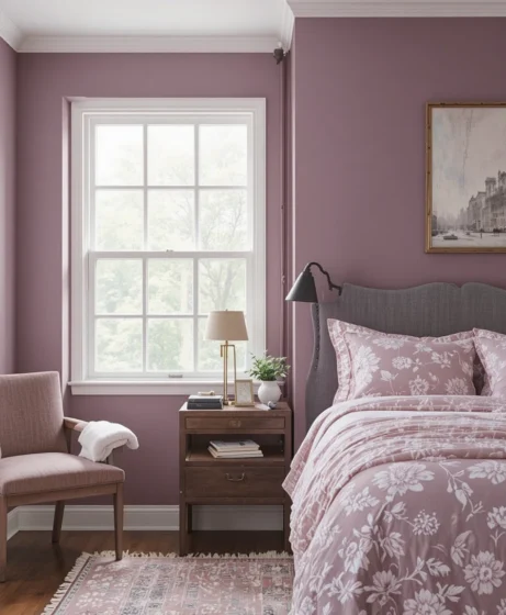
Sherwin-Williams: Veiled Violet
If you want to introduce a touch of drama without committing an entire room to a deep tone, coat your primary fireplace wall or headboard boundary in Sherwin-Williams: Veiled Violet. This color functions beautifully as a smoky, gray-forward accent that behaves like a shadow. It adds instant physical depth, making any flat drywall expanse look entirely custom-designed and high-end.
5. Warm Mauve Dining Room
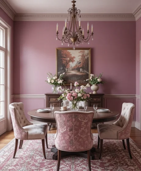
Sherwin-Williams: Dressy Rose
Dining rooms look best when wrapped in colors that appear intimate and cozy under low chandelier lighting. Sherwin-Williams: Dressy Rose features an increased ratio of rosy pink pigments, generating a comforting glow across your dining sets. Combine this hue with dark-stained oak dining tables and plush velvet dining chairs to elevate your hosting experiences.
Intimate Retreats and Curated Corridors
6. Romantic Mauve Bathroom
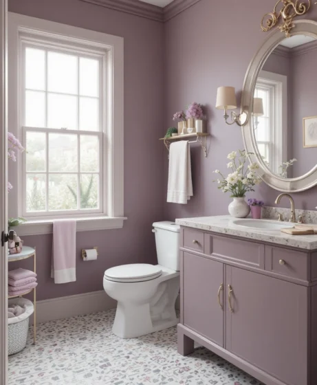
Sherwin-Williams: Silver Peony
Washrooms often suffer from looking too clinical or cold when finished purely in white porcelain and chrome. Introducing Sherwin-Williams: Silver Peony softens the space with an organic charm that makes the entire room feel like a high-end day spa. This gentle color plays beautifully with natural marble vanities, woven storage baskets, and polished nickel plumbing fixtures.
7. Mauve-Taupe Living Space
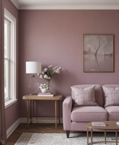
Sherwin-Williams: Imagine
For open-concept homes that require a continuous, modern neutral that breaks away from basic grays, Sherwin-Williams: Imagine is a masterful choice. This hybrid color sits perfectly on the fence between a rich earth taupe and a soft violet. It flows down long transition corridors flawlessly, picking up subtle highlight reflections throughout the morning and evening hours.
8. Deep Mauve Accent Corner
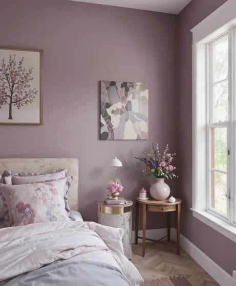
Sherwin-Williams: Plummy
Small powder rooms, walk-in closets, or dedicated reading alcoves are the perfect testing grounds for bold design choices. Sherwin-Williams: Plummy brings a luxurious, saturated depth that packs a serious punch of high-end drama. Introduce a plush velvet accent chair and a warm directional reading spotlight to craft a deeply cozy hideaway.
9. Vintage Mauve Hallway
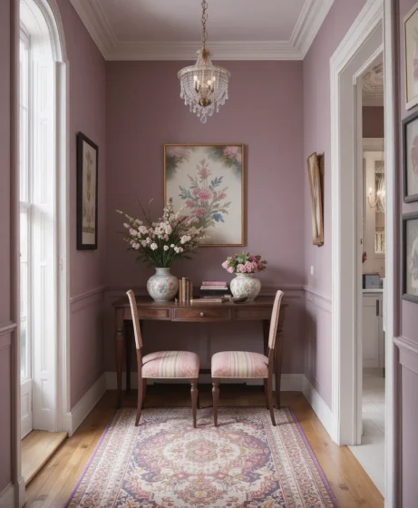
Sherwin-Williams: Wallflower
Long, narrow interior hallways often feel dark and uninspired due to a lack of direct window access. Applying Sherwin-Williams: Wallflower lifts these transition zones with a lovely, nostalgic charm that makes the path feel wider and brighter. The pastel undertone bounces artificial light paths gracefully down the corridor, setting up a happy introduction.
10. Soft Rosy-Mauve Nursery
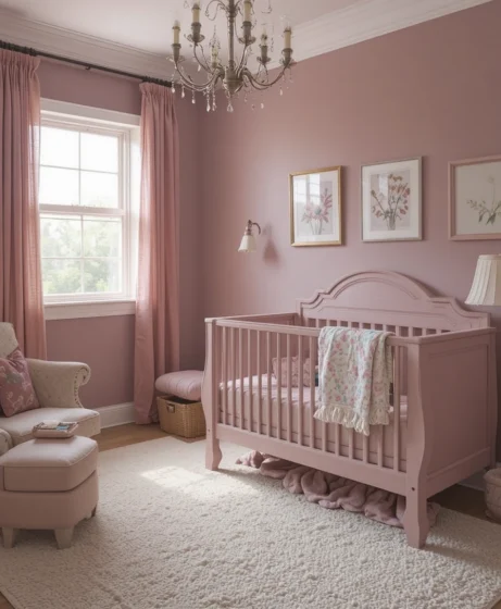
Sherwin-Williams: In the Pink
Avoid predictable baby pinks in favor of a timeless, soothing environment by painting your nursery walls in Sherwin-Williams: In the Pink. The subtle addition of gray and violet pigments prevents this soft rosy hue from looking overly bright or juvenile over time. This ensures the color scheme can easily grow with your child’s evolving tastes through the years.
🌸 Popular Mauve Paint Shades from Sherwin-Williams
When you are ready to visit your local paint desk, keeping a tight list of these specialized color formulas helps simplify your sourcing process. These specific options showcase different ratios of gray-to-purple pigments, allowing you to fine-tune your home’s mood:
Mauve Finery (SW 6282): A light, airy pastel that acts as an optimal light-refracting alternative to standard white walls.
Ash Violet (SW 6528): A rich, dust-coated mid-tone that grounds active social rooms with organic elegance.
Veiled Violet (SW 6268): A heavily desaturated, high-gray lavender that delivers a crisp, contemporary minimalist look.
Silver Peony (SW 6512): A romantic, soft pink-forward blend that builds a soothing, spa-like atmosphere inside high-moisture spaces.
Dressy Rose (SW 6024): A warm, sun-baked clay-pink hue packed with welcoming energy, ideal for gathering spaces.
Plummy (SW 6551): A dark, dramatic statement color that anchors architectural features and intimate accent fields.
🪞 Decorating Tips for Mauve Interiors
Bringing out the full, expensive potential of your selected color depends on supporting it with the correct material coordinates. Use these designer guidelines to lock in a harmonious, custom look:
Curate Your Color Pairings: Always balance your wall spaces by introducing furniture and trims in crisp alabaster whites, warm creams, rich camel taupes, or dark charcoal grays. This prevents your room from looking monochromatic or washed out.
Layer Luxurious Material Textures: Because these paint formulas feature a soft, velvety appearance, support them by adding rich materials into your upholstery selections. Think heavy velvet toss pillows, woven linen window panels, and thick wool area rugs to establish physical depth.
Introduce Natural Timber Warmth: Dark walnut wood grains, medium white oak flooring planks, and natural rattan baskets ground these colors beautifully. The golden tannins inside the timber elements provide an excellent visual counterweight to the cooler purple pigments.
Deploy Soft Accent Illumination: Avoid blinding overhead fluorescent lights that can make your paint look cold or washed out. Instead, rely on low-profile floor uplights placed behind leafy green house plants to cast soft leaf shadows across your walls.
💜 Why Choose Mauve Paint Colors?
Opting for this sophisticated color palette allows you to introduce real warmth and character without overwhelming your home’s structural design. These hybrid tones offer an incredible middle ground for modern, vintage, or transitional decor styles because they change character based on how you dress the room. The natural combination of royal purple, calming gray, and romantic rose creates an inviting visual escape that soothes the senses while remaining thoroughly current and stylish.
Optical Tricks & Pro Styling Hacks
When you are playing with complex colors, utilizing these interior physics rules allows you to alter spatial proportions instantly:
The Trim Elongation Illusion: If your ceilings feel low, paint your baseboards, doors, and trim casings in the exact same color as your walls, but raise the sheen to a Semi-Gloss finish. Removing the typical white horizontal breaking lines tricks the human brain into interpreting the walls as significantly taller.
The Shadow Correction Hack: Because these shades can pull slightly blue or cold in northern daylight, position a small warm-white LED lamp directly opposite your primary window. This fills in the dark corners, preserving the cozy, rosy side of the paint all day long.
The High-Contrast Accent Anchor: Always position your darkest piece of furniture—such as a charcoal velvet sofa or a black iron display cabinet—against your lightest wall. This high-contrast placement anchors the perimeter layout, keeping the soft color from looking too airy.
Scientific Data & Spatial Color Psychology
The implementation of complex, desaturated paint formulas inside common living environments changes our subconscious stress patterns far more than basic design choices suggest. According to specialized data from environmental psychology and interior physics:
The Neurological Benefit of Muted Tones: Pure, high-contrast white walls bounce harsh light rays across the room, forcing the human eye into constant focus adjustments that can induce minor cognitive fatigue. Introducing a desaturated neutral packed with purple-pink warmth and a heavy gray base absorbs scattering light currents while softening sharp contrast points. This material balance stabilizes sympathetic nervous system activity, helping lower daily cortisol levels and fostering a calmer, more relaxing social space for family bonding.
Furthermore, integrating soft wood elements next to these hues creates a balanced sensory environment that makes your home feel structurally solid and comforting.
Frequently Asked Questions (FAQ)
What trim color works best with mauve paint colors?
For a clean, high-contrast look, pair these shades with a crisp, neutral white like SW Pure White. If you prefer a softer, traditional atmosphere, select a warm cream white like SW Alabaster to draw out the paint’s underlying warmth.
Will mauve walls make my living room look dated or retro?
Not if you select options that feature a heavy gray undertone, such as Ash Violet or Veiled Violet. Pairing these dusty shades with modern, clean-lined furniture and matte black hardware keeps the look entirely current, expensive, and stylish.
How do I stop a mauve bedroom from looking too dark?
Ensure you choose a lighter, light-reflecting formula with a higher Light Reflectance Value, like Mauve Finery. Support the walls by layering crisp white bedding, large mirrors, and airy linen window draperies to bounce natural daylight around the room.
Final Thoughts
Refreshing your living spaces with an elegant color palette is an exceptionally effective way to express your design personality without launching a messy, expensive renovation project.
Whether your personal style leans toward clean, modern minimalism, warm organic textures, or moody luxury escapes, these 10 ideas provide an adaptable toolkit to bring your walls to life. By supporting your paint selections with correct lighting paths, rich fabric textures, and smart layout scales, you can easily turn simple drywall into a custom architectural highlight.
Trust your eye for visual balance, embrace the restorative properties of soft light layers, and enjoy your beautiful, relaxing new sanctuary for many years to come.
