

Selecting a paint palette that balance distinct personality with quiet relaxation is one of the most rewarding challenges in interior design. Throughout my decade of hands-on interior design experience, I have always guided my clients to look beyond standard, flat neutrals when trying to cultivate a true restorative retreat.
In 2026, creating a home that feels luxurious yet intimate relies heavily on complex tones that adapt dynamically to changing light environments. Violet Paint Colors have emerged as a definitive favorite for U.S. homeowners looking to inject elegant depth and modern romance into their living spaces. This sophisticated color family bridges the gap between calming cool blue tones and warm, energetic reds. The primary issue I see with DIY paint selections is failing to understand how a purple undertone behaves under different light sources, which can cause an otherwise beautiful room to look unexpectedly cold or overwhelming.
To solve this, I utilize a repeatable formatting system that balances paint formulas, light exposure, and surrounding textures to ensure your vertical surfaces look intentional, curated, and expansive. These 12 hand-picked concepts show exactly how to use this regal palette to transform your layout.
| Design Strategy | SW Color Pick | Ideal Room Exposure | Preferred Material Pairing |
| Airy Serenity | Lite Lavender | South-facing windows, nurseries | Light blonde ash wood, white linen |
| Sophisticated Neutral | Violet Verbena | Open floor plans, living zones | Charcoal textiles, unlacquered brass |
| Dramatic Luxury | Plum Dandy | Media rooms, focal accent walls | Rich walnut timber, velvet cushions |
Tools & Materials You Need
Before you drive permanent anchoring hardware into your drywall or apply tape to your baseboards, establishing these precise technical baselines prevents finish failures:
Premium Paint Base: Sherwin-Williams Emerald Interior acrylic latex formula in an Eggshell finish for wall surfaces, or Satin for high-traffic zones.
Trim and Case Molding: A crisp, high-contrast white paint like SW Pure White (SW 7005) in a Semi-Gloss or Gloss urethane trim enamel.
Roller Nap Specification: A premium $3/8\text{“}$ to $1/2\text{“}$ microfiber roller nap to achieve a glass-smooth application over standard residential drywall.
Lighting Temperature Target: High-efficiency LED light bulbs calibrated strictly between 2700K and 3000K to draw out the warm side of the violet pigments.
Detailed Step-by-Step Guide: 12 Violet Paint Color Ideas
Soft Lilacs and Balanced Living Zones
1. Soft Violet Dream Bedroom
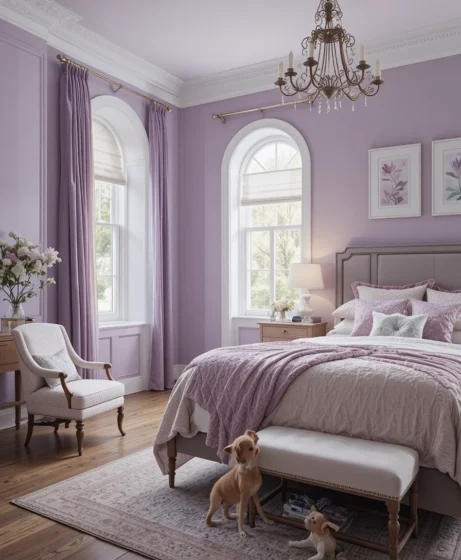
Sherwin-Williams Color: Lite Lavender
HEX: #E5DAF0 | RGB: 229, 218, 240
Using Sherwin-Williams: Lite Lavender (SW 6554) as your primary bedroom envelope provides an airy, whimsical base that feels completely restful. This light-reflecting pastel features a delicate balance of purple and white pigments that prevent the vertical wall planes from feeling heavy. I always recommend my clients pair it with crisp white cotton bedding and light oak furniture to maintain an open atmosphere.
2. Violet Verbena Living Room
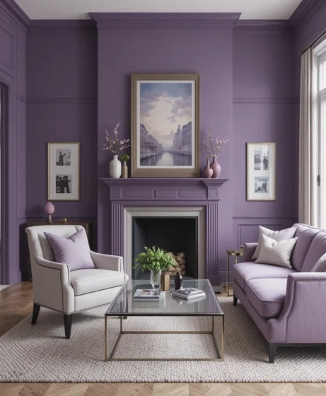
Sherwin-Williams Color: Violet Verbena
HEX: #9E8CA4 | RGB: 158, 140, 164
When designing a central gathering space that needs to feel sophisticated yet thoroughly inviting, Sherwin-Williams: Violet Verbena (SW 9072) is a magnificent choice. This color relies heavily on its gray undertones, allowing it to behave like an upscale, complex neutral. Frame your windows with long, sweeping charcoal drapery panels and slide in a cream wool area rug to ground the layout.
3. Lavender Sky Bathroom
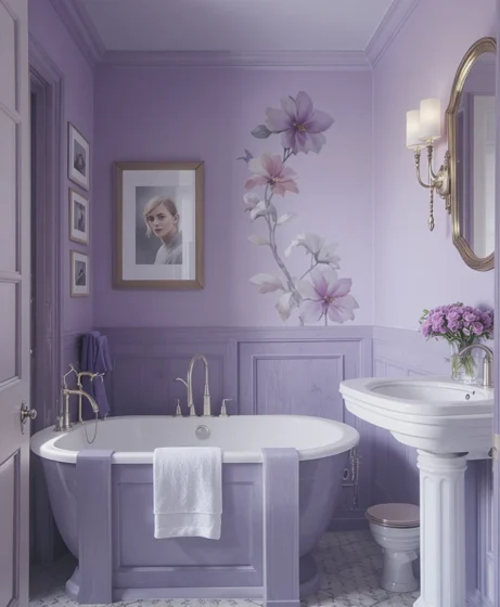
Sherwin-Williams Color: Lavender Sky
HEX: #D9D3EA | RGB: 217, 211, 234
High-moisture washrooms can look sterile if they are finished purely in basic white tiles and chrome pipes. Introducing Sherwin-Williams: Lavender Sky (SW 6547) transforms a tight bathroom layout into a gentle, romantic sanctuary. The soft purple pigment plays beautifully off natural marble counter vanities and polished nickel plumbing fixtures.
4. Mythical Mauve Hallway
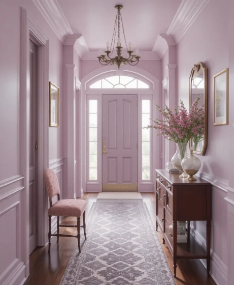
Sherwin-Williams Color: Mythical Mauve
HEX: #B9A1B8 | RGB: 185, 161, 184
Enclosed corridors often suffer from a lack of window light, which can make them feel tight, narrow, and uninspired. Applying Sherwin-Williams: Mythical Mauve (SW 6263) lifts these paths with a muted warmth that brings a timeless vintage charm. The earthy pink-gray notes inside this mix establish a welcoming tone that guides guests inward.
Mid-Tone Warmth and Artistic Spaces
5. Enchanted Violet Living Area
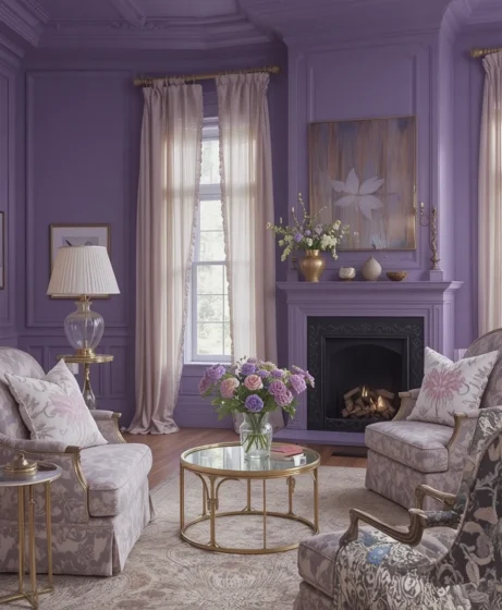
Sherwin-Williams Color: Enchanted Violet
HEX: #8C7AAE | RGB: 140, 122, 174
If you want your primary social spaces to radiate confidence and rich material depth, Sherwin-Williams: Enchanted Violet (SW 6550) delivers beautifully. This medium-bodied violet carries an inner warmth that captures shifting evening shadows gracefully. Pair it with unlacquered brass wall sconces, gold leaf frames, and dark-stained timber accents to maximize the regal finish.
6. Silver Peony Bedroom
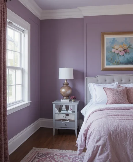
Sherwin-Williams Color: Silver Peony
HEX: #D7C9D9 | RGB: 215, 201, 217
Your sleeping quarters should function as a quiet escape from the frantic pace of the outside world. Coating your primary walls in Sherwin-Williams: Silver Peony (SW 6512) introduces a soft, powdery violet-pink glow that feels instantly soothing. Layer the bed with chunky knit wool blankets and raw linen throws to build a beautiful, textured cocoon.
7. Mauve Magic Dining Room
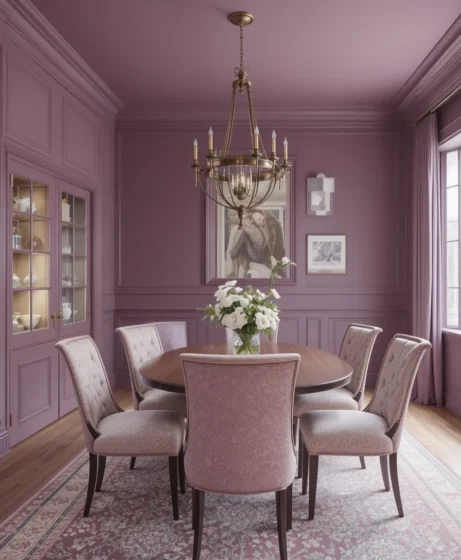
Sherwin-Williams Color: Mauve Magic
HEX: #B699A7 | RGB: 182, 153, 167
Dining rooms require a complex color foundation that looks exceptional under low, dim chandelier lighting. Sherwin-Williams: Mauve Magic (SW 6520) brings a dusty, sophisticated refinement to mealtime gatherings. The muted undertones keep the color looking mature, elegant, and perfectly coordinated with dark wood dining tables.
8. Obi Lilac Office Space
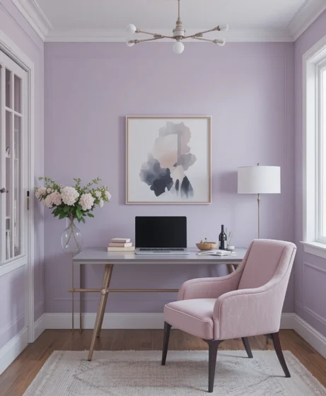
Sherwin-Williams Color: Obi Lilac
HEX: #C3B0CA | RGB: 195, 176, 202
Home workspaces require a balanced backdrop that supports mental focus without feeling cold or uncreative. Sherwin-Williams: Obi Lilac (SW 6556) offers a serene lilac wash with a stable gray foundation that keeps the brain calm and inspired. This shade forms a stunning frame around floating oak desks and matte black task chairs.
Saturated Depths and Regal Accent Walls
9. Plum Dandy Accent Wall
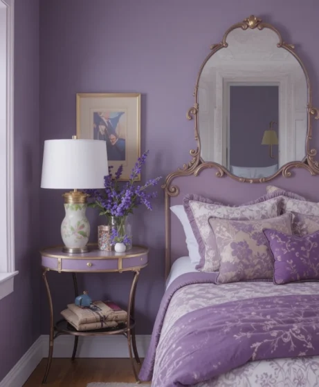
Sherwin-Williams Color: Plum Dandy
HEX: #705475 | RGB: 112, 84, 117
If you love high-contrast drama but want to avoid basic charcoals, coat your media wall or fireplace surround in Sherwin-Williams: Plum Dandee (SW 6284). This rich, luxurious plum-violet acts like a deep shadow, absorbing light rays beautifully. It gives a flat wall immense physical depth, making your artwork or framed screen stand out cleanly.
10. Amethyst Haze Living Room
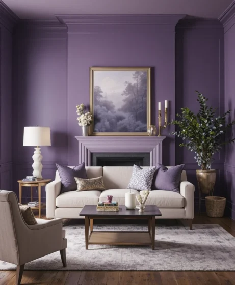
Sherwin-Williams Color: Amethyst Haze
HEX: #B6A0C1 | RGB: 182, 160, 193
For homeowners who prefer a cool, jewel-toned sanctuary feel, Sherwin-Williams: Amethyst Haze (SW 6002) is an exceptional styling tool. This serene, gemstone-inspired purple responds beautifully to shifting daylight hours, leaning gray in the morning and deeply amethyst by sunset. Pair it with soft beige upholstery and silver accents to create a balanced look.
11. Majestic Purple Accent
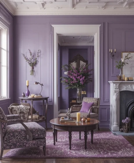
Sherwin-Williams Color: Majestic Purple
HEX: #5C4B7D | RGB: 92, 75, 125
When a room calls for an undeniable “wow” factor, applying Sherwin-Williams: Majestic Purple (SW 6545) establishes a bold, royal environment. This high-saturation violet works best when isolated to a singular, intentional accent wall, such as behind an entry console table. Ground the look by adding crisp white trim boundaries and vibrant green potted house plants.
12. Violet Twilight Bedroom
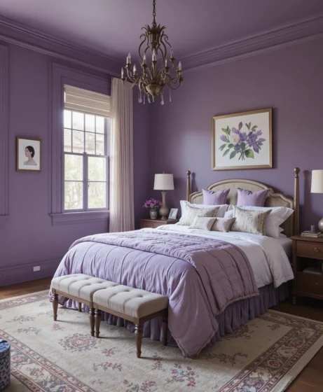
Sherwin-Williams Color: Violet Twilight
HEX: #A995C1 | RGB: 169, 149, 193
Sherwin-Williams: Violet Twilight (SW 6549) delivers a graceful, mid-tone violet wrap that infuses large bedrooms with a serene, balanced warmth. It strikes a beautiful middle ground between light lavender and deep plum, ensuring the room remains cozy without feeling cramped. Combine this shade with warm-white bedside table lamps to complete the romantic ambiance.
🎨 Popular Violet Paint Colors from Sherwin-Williams
Violet Verbena – sophisticated gray-violet blend
Plum Dandy – deep and dramatic purple
Lite Lavender – airy pastel violet
Silver Peony – romantic, soft tone
Majestic Purple – bold and luxurious accent
🛋️ Decorating Tips for Violet Interiors
Pair violet tones with gold, beige, cream, or gray for balance and elegance.
Use deeper shades like Plum Dandy or Majestic Purple for accent walls.
Mix lighter tones with soft fabrics and metallics for a glam yet soothing vibe.
Add fresh greenery or white décor to keep the look airy and modern.
💡 Why Choose Violet Paint Colors?
Violet paint colors bring a sense of creativity, calm, and romance. These hues balance warmth and coolness, making them perfect for bedrooms, living rooms, or accent spaces. Whether you want a soft pastel charm or a bold royal feel, violet shades offer endless elegance.
Optical Tricks & Pro Styling Hacks
When you are working within the strict structural confines of a standard room layout, using these professional interior physics rules alters how a person reads the space:
The Trim Elongation Illusion: If your living room features low ceilings, paint your baseboards, window casings, and doors in the exact same violet shade as the walls, but swap the sheen to Semi-Gloss. Removing the typical white horizontal breaking lines tricks the human brain into interpreting the walls as significantly taller.
The Shadow Multiplication Trick: When mounting a dynamic artwork arrangement over a light lavender wall, leave a $2\text{“}$ space between frames. This deliberate gap forms crisp, architectural shadow lines that make simple prints look like an expensive museum gallery build.
The High-Contrast Grounding Anchor: Always position your darkest furniture piece—such as a charcoal sofa or a deep walnut cabinet—directly against your lightest violet wall. This high-contrast staging anchors your floor plan, preventing light pastels from looking too airy or ungrounded.
Scientific Data & Spatial Neuro-Aesthetics
The color frequencies we choose to coat our home perimeters with reshape our subconscious comfort patterns far more than basic decoration preferences suggest. According to specialized data from environmental psychology and spatial lighting physics:
The Neurological Impact of Violet Waves: Saturated, high-gloss primary colors keep the human visual cortex in a state of continuous adaptation, which can elevate eye strain over long periods. Introducing a desaturated violet tone packed with gray and white bases absorbs scattering light rays while softening sharp contrast points. This balance reduces sympathetic nervous system activity, helping lower daily cortisol markers right as you cross the threshold into your private living space.
Furthermore, balancing the cool blue notes with warm red pigments within the violet matrix creates a stabilizing sensory environment that makes an interior feel structurally sound, comforting, and deeply familiar.
Frequently Asked Questions (FAQ)
What accent colors coordinate best with violet paint colors?
To build a balanced, high-end look, pair your violet walls with warm creams, rich beige, charcoal gray, or brushed gold metallics. This prevents the room from looking overly monochrome or childish.
Will a deep purple like Plum Dandy make my room look smaller?
Not if you confine the deep hue to a singular focal accent wall and support the rest of the layout with large mirrors, crisp white ceilings, and open window paths that allow natural daylight to bounce freely.
How do I stop a light lavender room from looking like a nursery?
The secret is incorporating sophisticated design elements like matte black hardware, structured geometric light fixtures, raw concrete planters, and natural wood furniture to ground the pastel tones.
💜 Final Thoughts
Refreshing your living environment with an elegant color palette is an exceptionally effective way to voice your personal style without starting a messy, expensive structural renovation.
Whether your personal taste centers on modern minimalism, warm organic textures, or moody luxury escapes, these 12 ideas provide an adaptable blueprint to bring your walls to life. By supporting your paint selections with correct lighting paths, rich fabric textures, and smart layout scales, you can easily turn simple drywall into a custom design highlight.
Trust your eye for visual balance, embrace the restorative properties of soft light layers, and enjoy your beautiful, relaxing new sanctuary for many years to come.
