

Selecting the ideal neutral backdrop is one of the most critical decisions you will make for your home. Throughout my decade of hands-on interior design experience, I have always guided my clients to treat wall colors not as filler, but as the foundational anchor for natural light, spatial flow, and structural balance.
In 2026, creating a home that feels open yet deeply comforting relies on complex shades that shift gracefully throughout the day. Premium Light Gray Paint Colors have become a staple in modern residential styling because they offer unmatched versatility, bridging the gap between minimalist crispness and traditional warmth. The most common pitfall I see with casual DIY projects is picking a gray sample under showroom fluorescent tubes, only to realize later that it pulls intensely blue, purple, or green once applied to the actual drywall.
To prevent this, I utilize a repeatable selection system rooted in lighting physics and undertone matching. These 12 hand-picked formulas from Sherwin-Williams will help you establish an elegant, sophisticated atmosphere that adapts to your life beautifully.
| Color Pick | Light Reflectance Value (LRV) | Primary Undertone | Best Architectural Match |
| Agreeable Gray | 60 | Warm Beige / Greige | Open-concept main floors, low-light family dens |
| Repose Gray | 58 | Warm Taupe / Soft Violet | Sunny south-facing living areas, main suites |
| Light French Gray | 53 | True Neutral / Cool Blue | Crisp traditional trim, architectural molding |
| Silver Strand | 59 | Mint Green / Soft Slate | Spa-inspired primary baths, restful nurseries |
Tools & Materials You Need
Before opening a single can of paint or applying tape to your baseboards, securing these exact technical specs will guarantee a flawless finish:
Paint Formula Base: Sherwin-Williams Emerald Interior Acrylic Latex in an Eggshell or Satin sheen for excellent light diffusion on wall surfaces.
Trim & Casing Solution: Premium Urethane Alkyd Enamel in a Semi-Gloss finish to establish a crisp, easily cleanable frame against your gray walls.
Microfiber Roller Standard: A high-quality $3/8\text{“}$ to $1/2\text{“}$ gap roller nap to prevent micro-stippling and ensure a glass-smooth surface.
LED Color Temperature: Energy-efficient lighting bulbs calibrated strictly between 3000K and 3500K to prevent your grays from washing out or pulling cold.
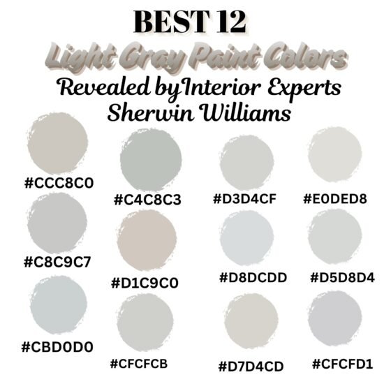
Detailed Step-by-Step Guide: 12 Light Gray Paint Colors
Warm-Toned Grays and Greiges
1. Repose Gray Living Room
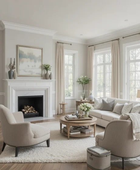
Sherwin-Williams Color: Repose Gray (SW 7015)
HEX: #CCC8C0 | RGB: 204, 200, 192
Applying Sherwin-Williams: Repose Gray (SW 7015) across a main family room delivers an instantly cozy foundation that avoids looking flat or sterile. This masterfully balanced tone features subtle brown and taupe undertones, allowing it to adapt effortlessly to changing afternoon sun rays. I always recommend my clients pair this living room staple with crisp white trim and light oak furniture to keep the layout feeling completely current and airy.
2. Light French Gray Bedroom
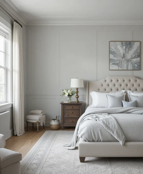
Sherwin-Williams Color: Light French Gray (SW 0055)
HEX: #C8C9C7 | RGB: 200, 201, 199
When your sleeping quarters call for an upscale, historic personality, Sherwin-Williams: Light French Gray (SW 0055) is an absolute designer favorite. This medium-bright hue behaves like a true, authentic gray, drawing its depth from cool French slate patterns. Frame your bed with dark walnut bedside tables and layered ivory linen sheets to create a high-end, restful hotel ambiance.
3. Gray Screen Kitchen
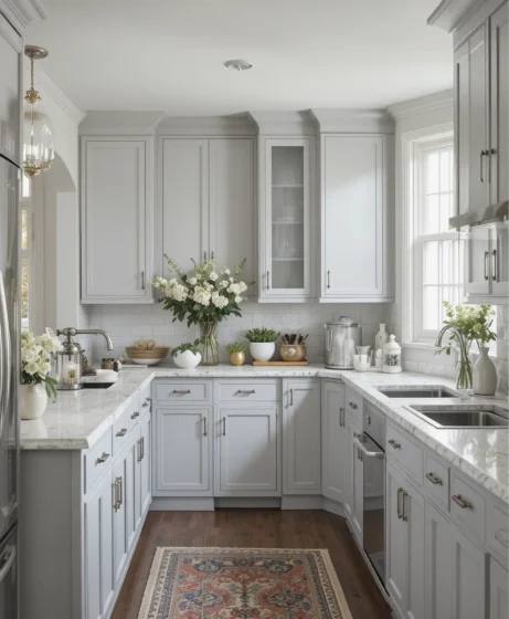
Sherwin-Williams Color: Gray Screen (SW 7071)
HEX: #CBD0D0 | RGB: 203, 208, 208
Kitchen areas loaded with busy cabinet lines and stone countertops benefit greatly from a clean, stabilizing background grid. Sherwin-Williams: Gray Screen (SW 7071) introduces a modern, cool-toned silver footprint that works exceptionally well alongside stainless steel appliances. Its crisp profile helps a busy kitchen layout feel structured, clean, and beautifully organized.
4. Silver Strand Bathroom
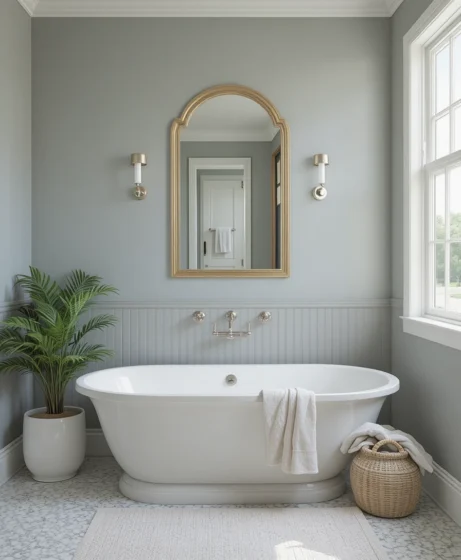
Sherwin-Williams Color: Silver Strand (SW 7057)
HEX: #C4C8C3 | RGB: 196, 200, 195
High-humidity washrooms can easily feel clinical if you finish them solely in stark, basic white tiles. Introducing Sherwin-Williams: Silver Strand (SW 7057) softens the room by displaying a shifting, sea-glass mix of gray, green, and blue pigments. This organic chameleon quality makes compact bathrooms feel like a custom luxury spa retreat.
5. Agreeable Gray Dining Room
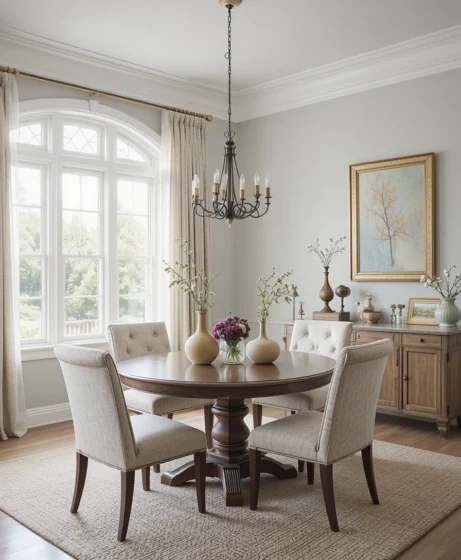
Sherwin-Williams Color: Agreeable Gray (SW 7029)
HEX: #D1C9C0 | RGB: 209, 201, 192
If you are worried about your space feeling too cold or detached, Sherwin-Williams: Agreeable Gray (SW 7029) is the ultimate foolproof solution. As an iconic greige, it contains a significant amount of beige pigment that actively counters dark shadows. It creates a warm, deeply inviting backdrop for formal dining spaces, especially when paired with glowing brass chandeliers.
Balanced Neutrals and Bright Spaces
6. Passive Gray Hallway
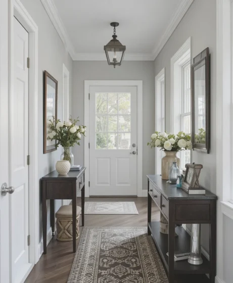
Sherwin-Williams Color: Passive (SW 7064)
HEX: #CFCFCB | RGB: 207, 207, 203
Enclosed corridors and transitional open-concept halls often suffer from uneven light distribution, making color matching tricky. Sherwin-Williams: Passive (SW 7064) provides an unyielding, true gray anchor that does not favor warm or cool extremes. It runs down long hallway paths predictably, establishing a clean, uniform flow from room to room.
7. Lattice Gray Living Area
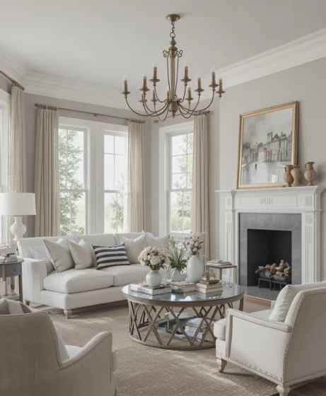
Sherwin-Williams Color: Lattice (SW 7654)
HEX: #D3D4CF | RGB: 211, 212, 207
For homes that seamlessly blend classic antiques with modern, low-profile silhouettes, Sherwin-Williams: Lattice (SW 7654) is a magnificent choice. This pale gray features a tiny hint of warm undertone that takes the edge off cold plaster surfaces. It serves as a highly supportive background for displaying architectural millwork and custom built-in cabinetry.
8. Olympus White Office
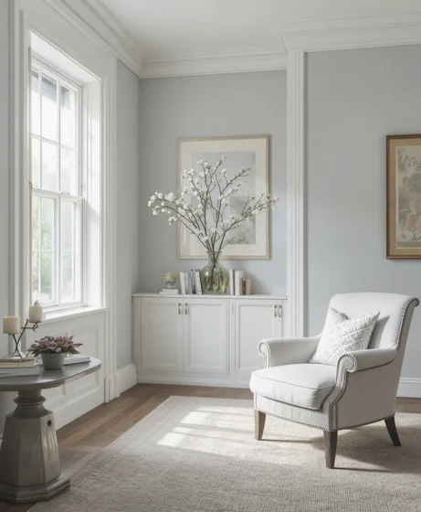
Sherwin-Williams Color: Olympus White (SW 6253)
HEX: #D8DCDD | RGB: 216, 220, 221
Workspaces require a calm, clear wall palette that reduces visual fatigue while keeping your mind sharp and creative throughout the day. Sherwin-Williams: Olympus White (SW 6253) is a heavily desaturated gray-blue that brightens rooms instantly. It behaves like a permanent morning sky, transforming dark home offices into high-productivity zones.
9. Crushed Ice Bedroom
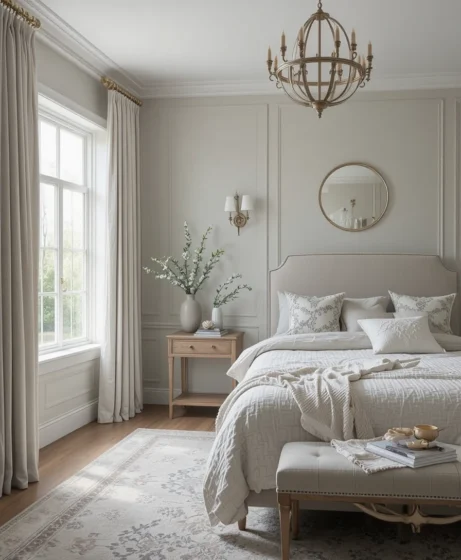
Sherwin-Williams Color: Crushed Ice (SW 7647)
HEX: #D7D4CD | RGB: 215, 212, 205
If you love the brightness of white walls but crave the architectural depth of a real color, Sherwin-Williams: Crushed Ice (SW 7647) belongs on your test board. This pale, subtle gray contains warm, sandy undertones that peek out under soft evening lamps. It hugs your bedroom perimeter gently, creating an intimate, cozy atmosphere without closing the walls in.
10. Eider White Living Room
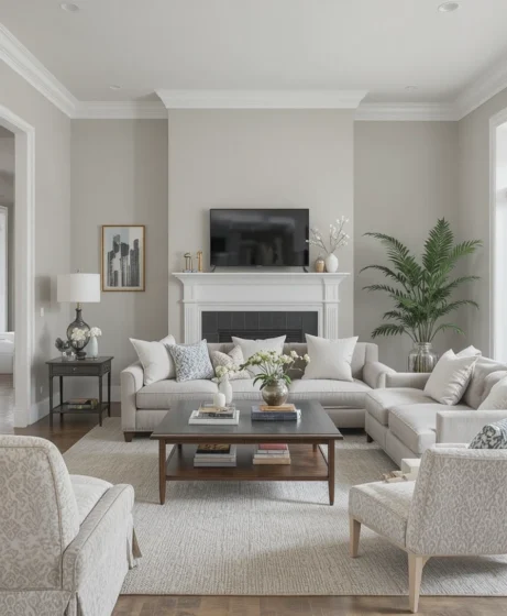
Sherwin-Williams Color: Eider White (SW 7014)
HEX: #E0DED8 | RGB: 224, 222, 216
Minimalist design lovers know that finding a white paint that doesn’t look like a commercial gallery is surprisingly difficult. Sherwin-Williams: Eider White (SW 7014) solves this by blending a large amount of pure white base with a soft gray drop. It provides an ultra-bright finish for modern living zones, making it an excellent uniform choice for both walls and ceilings.
11. Front Porch Kitchen
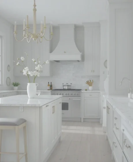
Sherwin-Williams Color: Front Porch (SW 7651)
HEX: #D5D8D4 | RGB: 213, 216, 212
Sherwin-Williams: Front Porch (SW 7651) is an exceptional cool-toned gray infused with quiet green undertones that bring a refreshing crispness indoors. This color feels deeply connected to natural exterior elements, making it perfect for framing kitchen windows overlooking a backyard garden. Pair it with dark soapstone countertops and white porcelain farm sinks to maximize the contrast.
12. Reflection Hallway
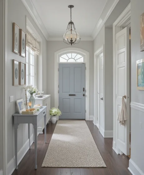
Sherwin-Williams Color: Reflection (SW 7661)
HEX: #CFCFD1 | RGB: 207, 207, 209
Long, windowless entryways require a color that acts like an artificial light multiplier. Sherwin-Williams: Reflection (SW 7661) relies on crisp, sky-blue undertones to bounce incoming doorway light deep into dark corners. This subtle blue-gray behavior gives your foyer an immediate sense of spaciousness, ensuring your home feels welcoming the moment you step inside.
Popular Light Gray Paint Colors from Trusted Brands
When you are ready to visit your local paint desk to build out your sample boards, keeping this edited list of proven, field-tested classics will simplify your search:
Repose Gray (SW 7015): A warm, highly adaptable gray-beige that softens large spaces effortlessly.
Light French Gray (SW 0055): A true historic neutral that delivers immediate gallery authority to living zones.
Agreeable Gray (SW 7029): The ultimate residential greige that adds cozy warmth to low-light areas.
Silver Strand (SW 7057): A serene, ocean-inspired gray-green perfect for spaces meant for winding down.
Reflection (SW 7661): A cool, crisp, modern finish that works beautifully as a daylight multiplier.
Decorating Tips for Light Gray Interiors
Unlocking the full, designer-level potential of Light Gray Paint Colors relies entirely on how you layer materials against them. Use these expert guidelines to keep your rooms looking warm, intentional, and expensive:
Curate Your Color Anchors: Never pair light gray walls with entirely gray furniture sets, as this causes the layout to look cold and institutional. Instead, layer in crisp alabaster whites, soft linen creams, deep charcoal charcoals, or warm camel beiges to maintain a healthy visual rhythm.
Introduce Warm Metallic Accents: Introduce unlacquered brass, brushed gold, or antique copper light fixtures and picture frames across your rooms. The warm glow of these living metals contrasts beautifully against gray backgrounds, adding a rich touch of luxury.
Layer Dense Material Textures: Because smooth gray drywall can appear flat on its own, bring in tactile variety through your textiles. Use heavy wool area rugs, chunky bouclé toss pillows, raw linen window panels, and woven rattan storage baskets to add depth.
Mix Your Wood Tones Wisely: Avoid matching all your wood finishes perfectly. Let light oak floors, medium walnut coffee tables, and dark mahogany frames interact naturally against your gray walls, drawing out different undertone strengths.
Why Choose Light Gray Paint Colors?
Opting for a light gray color strategy is about far more than following a passing trend—it is a smart design choice to build an adaptable emotional refuge. These nuanced shades provide a stable, highly efficient backdrop that coordinates smoothly with changing style updates over time. Because they sit right on the line between cool and warm, grays absorb the specific textures of your rugs and fabrics, giving your home a beautifully tailored look that feels collected rather than forced.
Optical Tricks & Pro Styling Hacks
When you are trying to maximize standard room dimensions, using these interior physics rules alters how your brain maps out the space:
The Unified Trim Secret: If you have eight-foot ceilings, paint your baseboards, crown trim, and window casings in the exact same gray color as your walls, but bump the sheen to a soft Satin. Removing the typical white horizontal breaking lines tricks the eye into interpreting the wall as significantly taller.
The High-Contrast Artwork Grid: When framing your favorite photography collections, utilize extra-wide white matting panels inside thin, dark iron frames. Staging this clean setup against a light gray wall forces the artwork to pop forward like a distinct architectural window.
The Anti-Reflective Shading Hack: If your gray paint pulls slightly cool or blue in northern daylight, place a warm 2700K lamp directly opposite the main window exposure. This artificial pool of light fills in cold corners, keeping the cozy side of your paint visible all evening long.
Scientific Data & Color Psychology Parameters
The specific pigment mixes we choose to coat our main living perimeters with alter our subconscious resting patterns far more than basic aesthetic preferences suggest. According to specialized data from environmental psychology and spatial lighting physics:
The Neurological Value of Balanced Grays: Pure, high-contrast white wall surfaces bounce light reflections erratically, forcing the human visual cortex into a state of continuous focus adjustment that can induce subtle eye strain over long hours. Introducing a desaturated neutral featuring an optimal Light Reflectance Value (LRV) near 60 absorbs high-frequency scattering light rays while softening sharp room edges. This balanced visual landscape lowers sympathetic nervous system activity, helping reduce daily cortisol markers right as you cross your home threshold.
Furthermore, integrating natural wood grains next to these balanced colors provides a material counter-weight that stabilizes our subconscious perception of the room’s temperature and structural security.
Frequently Asked Questions (FAQ)
What is the difference between a true gray and a greige paint color?
A true gray relies on a mix of black and white bases with subtle blue or green undertones, yielding a cool, crisp look. A greige combines gray with a heavy dose of yellow or brown beige base, introducing automatic warmth and preventing shadows from looking cold.
How do I stop light gray paint colors from looking too blue?
The easiest way is to choose formulas with warm taupe or beige bases, like Agreeable Gray or Repose Gray. Additionally, avoid cool 5000K daylight LED bulbs in favor of warm-white 3000K sources to balance the undertones out.
Can I use the same gray paint color on both walls and ceilings?
Yes, absolutely. Using an ultra-light gray like Eider White across both surfaces removes the harsh breaking line between wall and ceiling, creating a seamless, floating effect that makes small rooms look considerably more expansive.
🧡 Final Thoughts
Refreshing your living environment with a thoughtful neutral color palette is an exceptionally effective way to express your design perspective without launching a messy, expensive renovation project.
Whether your personal taste centers on clean modern minimalism, warm organic textures, or traditional heritage styles, light gray paint colors supply an adaptable foundation that elevates every piece of furniture you own.
By supporting your walls with proper lighting paths, rich fabric textures, and smart layout scales, you can easily turn simple drywall into a custom design masterpiece. Trust your eye for visual balance, embrace the restorative properties of soft light layers, and enjoy your beautiful, relaxing new sanctuary for many years to come.
