

When I consult with clients on residential styling, the single biggest hurdle they face is creating a space that feels deeply restorative without looking like a cold, clinical hotel room. Most people recognize that a bathroom should serve as an intimate sanctuary, yet they end up defaulting to safe, stark neutrals that trigger zero emotional comfort. Your spaces hold the psychological framework of your entire morning and evening routines, meaning your choices directly influence how easily your nervous system decompresses at night.
In my decade of hands-on interior design experience, I have developed a repeatable system that moves beyond temporary trends, focusing instead on how natural light reflectance and biophilic undertones alter the spatial layout of your room. By matching your color palette with your natural lighting architecture and layering texturized materials, you can easily implement Pastel Bathroom tones that feel highly custom, grounding, and personal.
The secret to mastering this organic design system is understanding that a color does not exist in a vacuum; it changes constantly based on fabric weights, pile densities, and lighting variables. Below is my designer handbook alongside 22 expanded, deeply detailed layout concepts to completely transform your private space.
| Design Category | Suggested Palette | Best Lighting Condition | Target Spatial Vibe |
| Serene & Calming | Soft Blush, Mint Green, Ice Blue | Morning Eastern Light | Lowers heart rate; ultra-restful |
| Crisp & Modern | Powder Blue, Soft Gray-Blue, Charcoal | High-Output Natural Light | Structured, architectural, clean |
| Warm & Earthy | Pale Peach, Soft Coral, Powder Yellow | Afternoon Western Light | Nurturing, intimate, protective |
| Rich & Luxurious | Pale Lavender, Lilac, Metallic Gold | Low-Level Amber Lighting | Boutique hotel-grade drama |
Tools & Materials You Need
Before opening any paint cans or moving heavy plumbing fixtures, collecting these professional-grade tools and technical specifications will ensure a seamless execution:
High-CRI Test Lamps: Use adjustable LED bulbs featuring a Color Rendering Index (CRI of 92+) to view paint swatches under 2700K (warm evening) and 4000K (cool daytime) illumination.
Large Peel-and-Stick Paint Samples: Measuring at least 12″ x 12″ to move across different walls throughout the day, ensuring the undertones look right in every corner.
Low-Tack Precision Edge Painter’s Tape: Crucial for achieving razor-sharp lines along your baseboards and shower boundaries.
Digital Laser Distance Measure: Essential for mapping your floor plan to ensure a minimum of 32 inches of open walking clearance around all sides of your vanity.
Microfiber Roller Covers: Look for a 3/8-inch nap to achieve a smooth, velvet-like finish on standard interior drywalls.
Detailed Step-by-Step Guide: 22 Tailored Concepts
1. Soft Blush Pink Walls
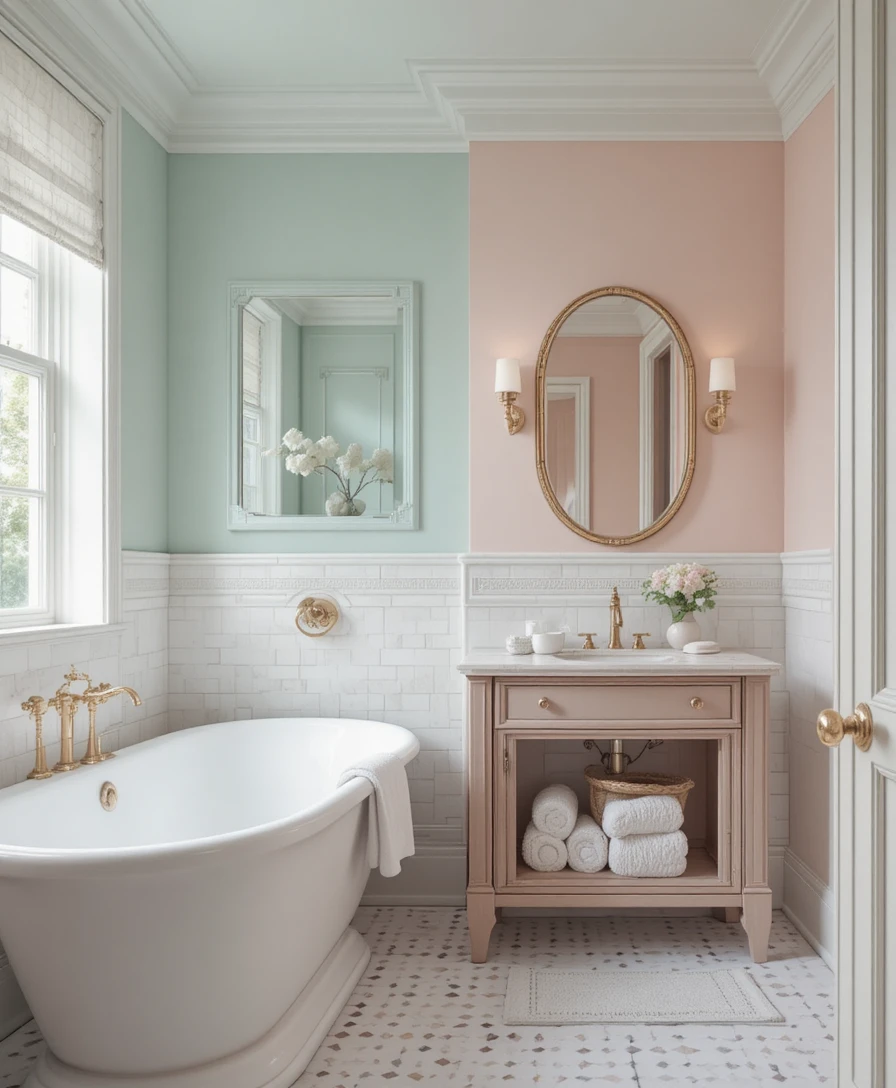
Soft blush pink functions as a timeless, highly sophisticated foundation that brings immediate architectural calm to a space. When implementing this look, I always recommend choosing a premium matte paint with subtle warm undertones to keep the room from looking cold or overly sweet. Pair these gentle walls with crisp white tiles and warm rose gold fixtures to create an exceptionally elegant and airy environment where your Pastel Bathroom palette can breathe.
2. Mint Green Cabinets
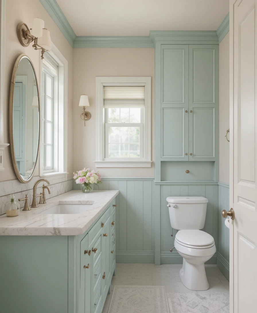
Mint green cabinetry adds an incredibly fresh and airy vibe to your main bathroom layout. I love specifying this tone for millwork because it bridges the gap between clean contemporary lines and organic, nature-inspired design. Combine these custom cabinets with neutral quartz countertops and light oak accents to achieve a perfectly balanced, sophisticated aesthetic.
3. Pale Lavender Tiles
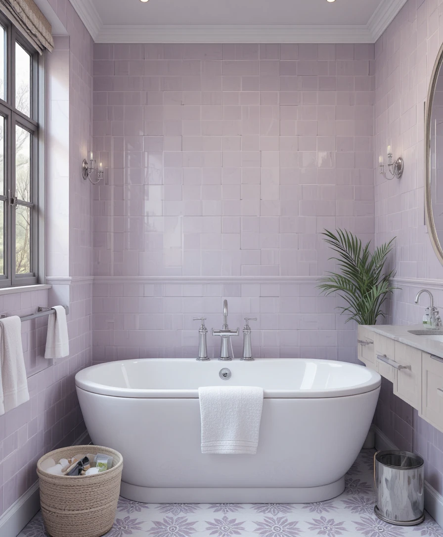
Pale lavender surfaces on your primary walls or vanity backsplash create a deeply relaxing, spa-like atmosphere. The cool purple undertones work quietly to reduce visual glare, making the space feel peaceful during early morning routines. Complement this soft tile choice with polished silver fixtures, crisp white linen hand towels, and subtle green foliage for a harmonious finish.
4. Baby Blue Shower Area
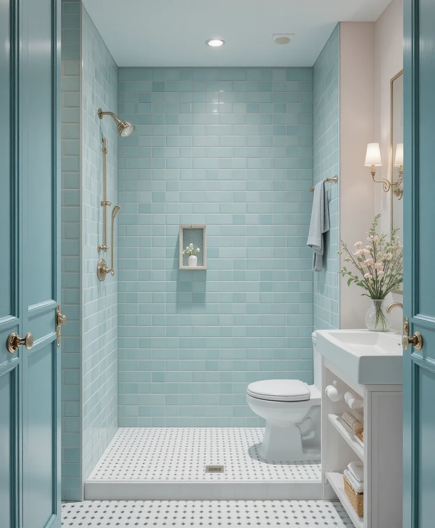
Installing baby blue tiles directly inside the shower enclosure makes the entire space feel cool, clean, and structurally serene. It mimics the light-reflective qualities of natural water, giving a narrow walk-in stall a spacious look. I always suggest mixing these light panels with classic white grout lines to keep the design feeling incredibly soft, bright, and inviting.
5. Soft Peach Vanity
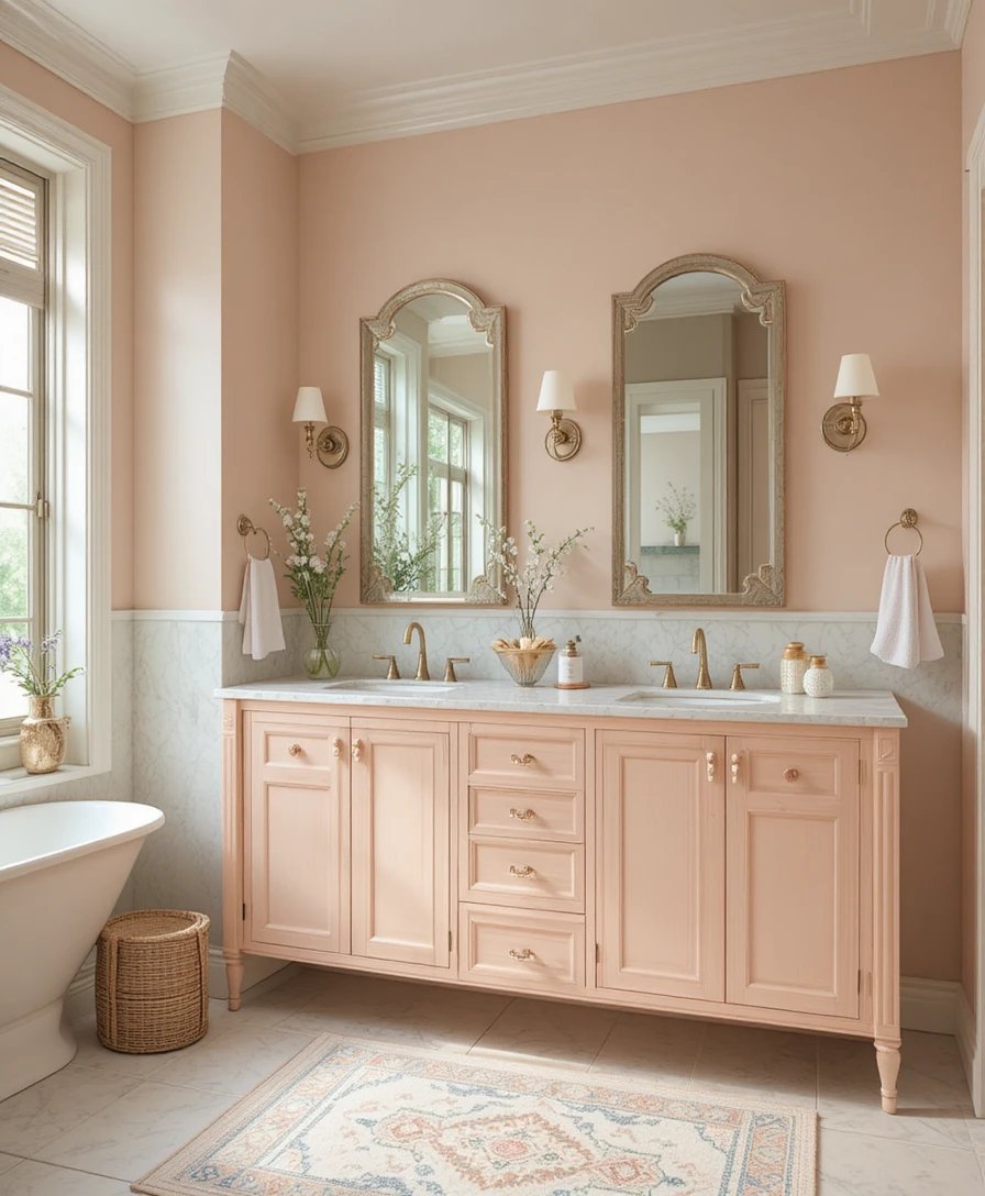
A custom vanity finished in a soft pastel peach tone instantly brightens dark, windowless spaces. The underlying orange pigments in the peach formulation add a subtle glow that flatters your skin tone in the vanity mirror. Pair this statement feature piece with neutral plaster walls and natural wood accessories for a modern yet cozy touch.
6. Powder Yellow Accents
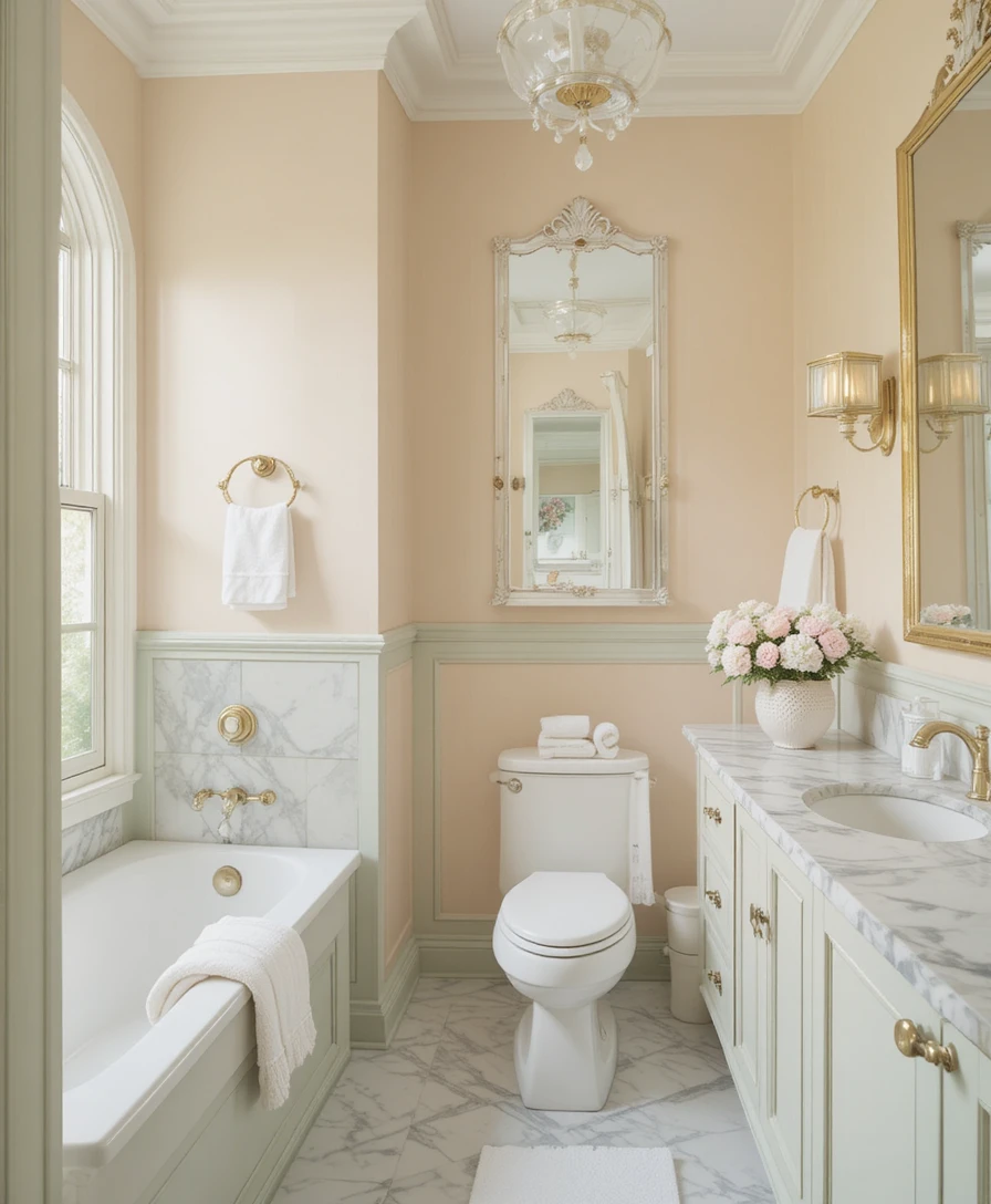
Powder yellow surfaces inject a wonderful sense of sunny warmth and optimistic energy into your personal retreat. Because pale yellow can turn neon under the wrong lighting, restrict this tone to accent walls, premium bath towels, or small decorative canisters. This choice works beautifully alongside high-end white marble countertops and polished nickel hardware.
7. Light Aqua Cabinets
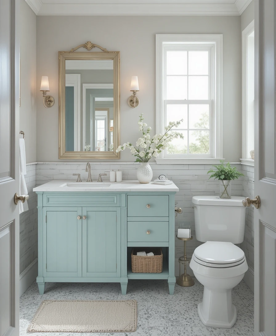
Light aqua features bring a timeless coastal, refreshing feel directly into the center of your floor plan. The seamless blend of blue and green pigments mimics the appearance of a breezy ocean oasis. Combine this cabinetry finish with bright white subway tiles and soft, desaturated gray walls to secure a calm, breezy ambiance year-round.
8. Lilac Wall Panels
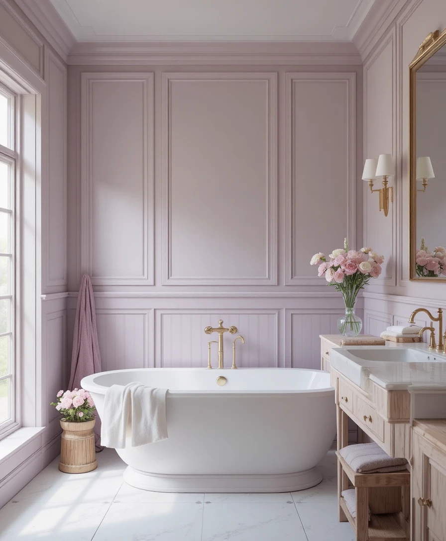
Lilac wall panels provide an incredibly romantic, sophisticated, and deeply relaxing backdrop for traditional or vintage layouts. This specific pastel formulation stands out with incredible grace when applied over architectural wainscoting or tongue-and-groove boards. It pairs flawlessly with polished gold or unlacquered brass fixtures for a luxurious touch.
9. Soft Coral Tiles
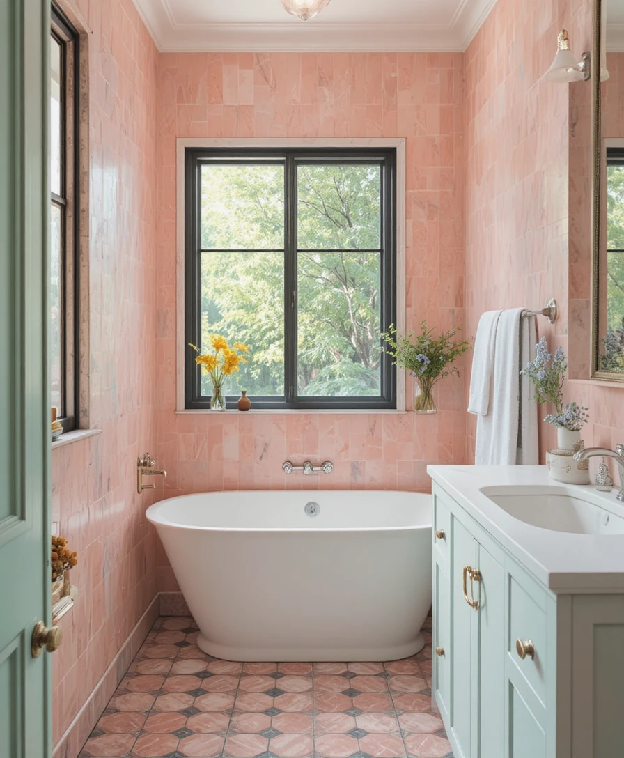
Pastel coral tiles add a beautiful, controlled layer of natural energy to a room without overwhelming its visual boundaries. The earthy pink-orange undertone provides an ideal solution for feature walls inside a master shower or behind a freestanding tub alcove. Balance this richness with sandy beige accents to preserve a soft, high-end aesthetic.
10. Powder Blue Vanity
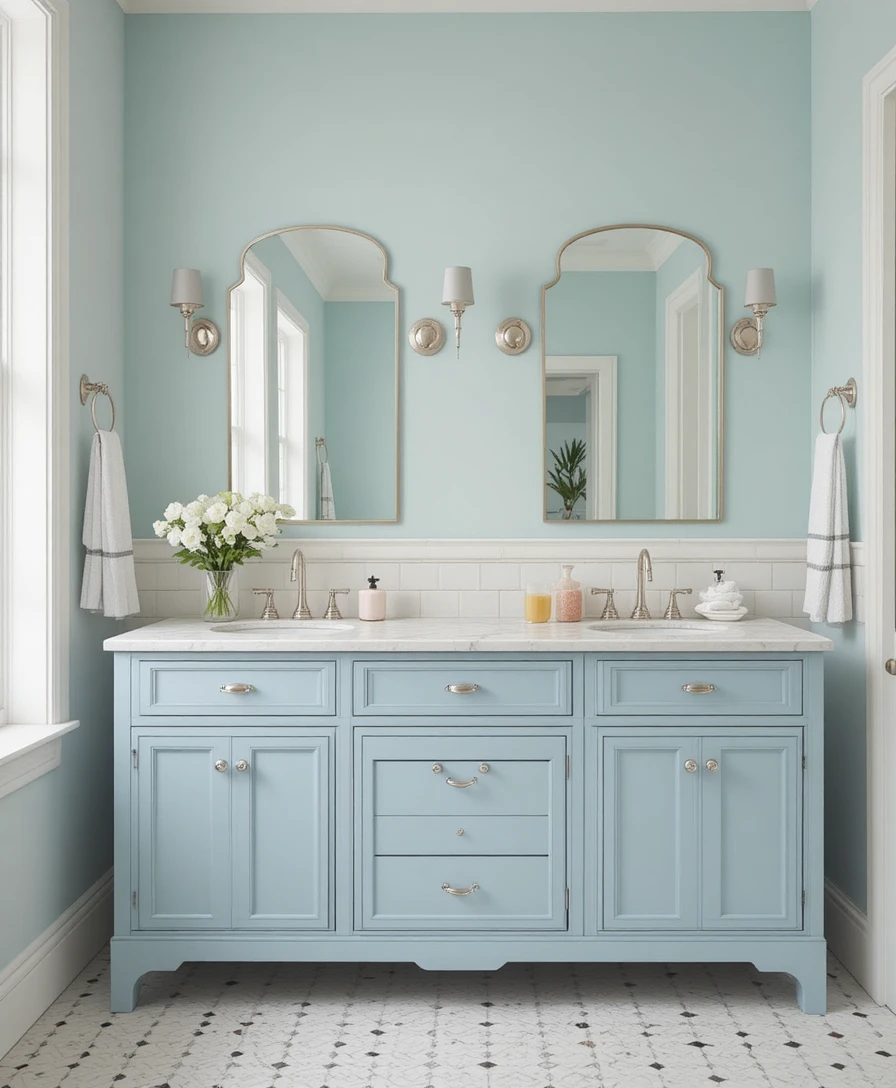
A powder blue vanity creates a cool, deeply sophisticated vibe that serves as an absolute classic in luxury American homes. The soothing nature of the blue pigment works to visually ground a heavy cabinet piece, making it feel lighter across your floor plan. Pair the vanity with cream walls and chrome fixtures to achieve an atmosphere of timeless elegance.
11. Pastel Green Walls
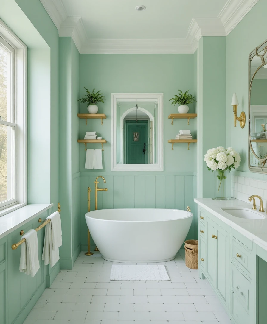
Pastel green walls evoke a fresh, botanical feel that forms an excellent foundation for an authentic biophilic environment. This calming shade helps lower physical sensory input, making it an incredible tool for evening wind-down routines. Complement these walls with open, natural wood shelving arrays and textured white ceramic tiles for a organic, spa-like look.
12. Pale Pink Accessories
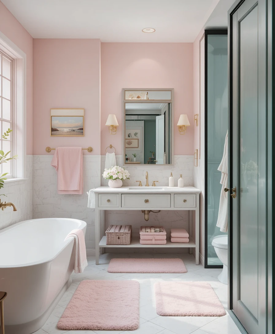
If you are renting or simply prefer a design system that allows for easy seasonal changes, use your textiles as a canvas for contrast. Introduce plush pale pink bath mats, waffle-weave towels, and heavy ceramic soap dispensers against an ivory wall base. This choice injects instant physical warmth and personality without requiring permanent paint.
13. Soft Gray-Blue Floor Tiles
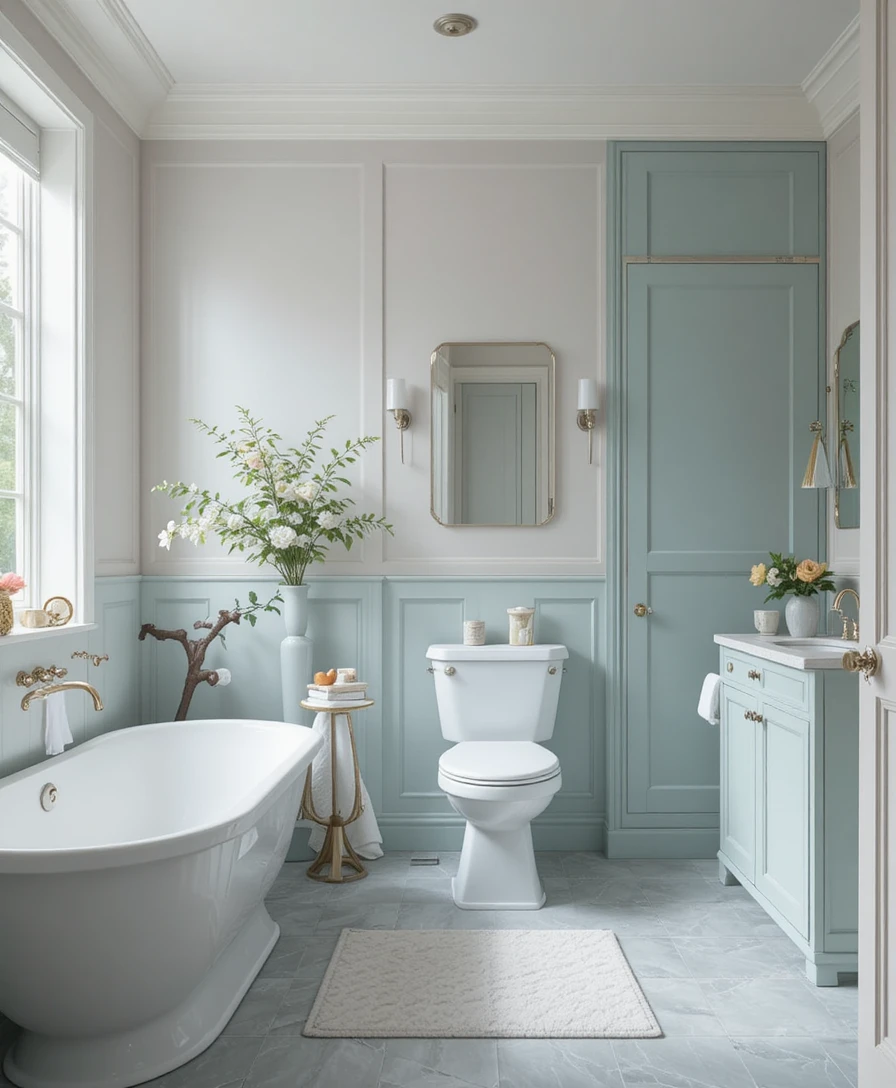
Utilizing soft gray-blue tiles across the floor plane adds an incredible touch of sophistication while keeping the lower layout light and airy. The subtle gray undertone keeps the blue from looking too bright or distracting beneath your feet. Pair this flooring choice with true white walls to maximize the structural contrast of your Pastel Bathroom.
14. Mint Green Wall Panels
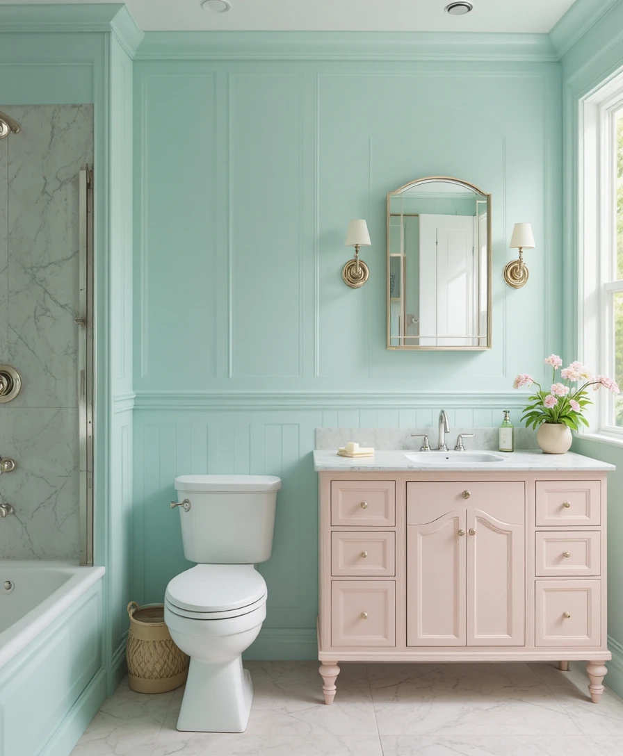
Installing mint green wall panels directly behind your main vanity space adds an unexpected layer of architectural depth and crisp freshness. The vertical lines of the paneling trick the brain into perceiving the ceiling line as significantly higher than it is. Finish the layout with a smooth pastel countertop to maintain a cohesive, designer-grade look.
15. Peach and White Patterned Tiles
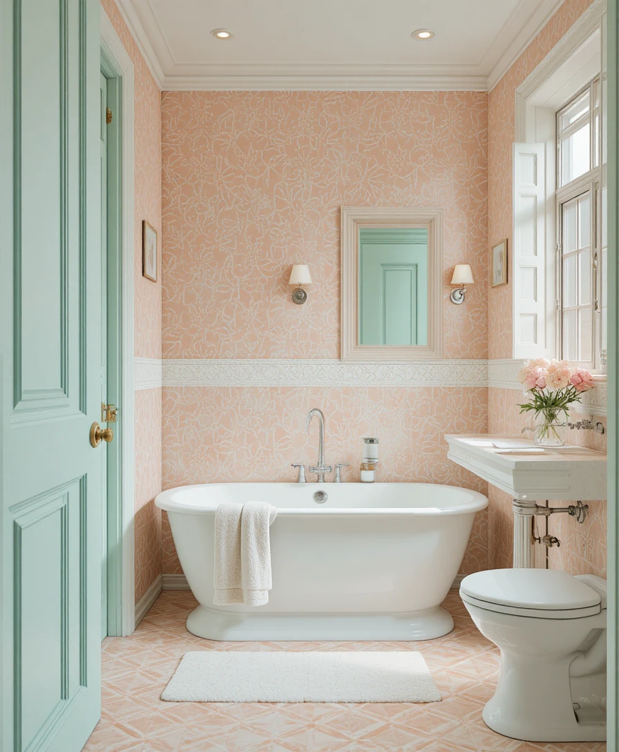
Peach and white patterned tiles create a playful, highly artistic, yet gentle vibe across underutilized vertical or horizontal surfaces. I recommend using this geometric approach strictly on a small feature wall or a vanity backsplash to avoid visual clutter. The soft pattern breaks up flat drywall, adding character and high-end charm.
16. Soft Lavender Accessories
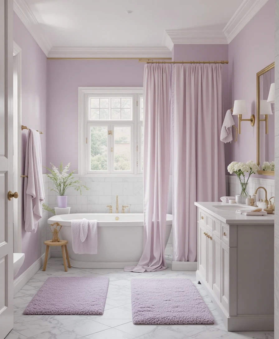
Incorporate soft lavender-colored towels, woven laundry hampers, and heavy linen shower curtains to introduce calm elegance into a neutral footprint. These soft purple textiles look exceptionally striking when layered against pale gray or stark white walls. This simple method introduces high texture and premium comfort to the room effortlessly.
17. Powder Yellow Vanity
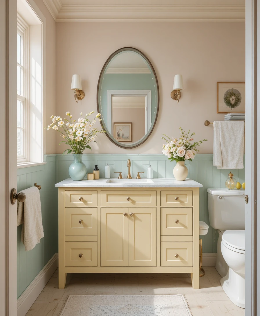
A powder yellow vanity adds a highly cheerful, comforting warmth to your layout without dominating the physical or visual scale of the room. It acts as an excellent substitute for traditional wood stains, offering an unexpected pop of character. Combine this bright feature piece with soft pastel gray wall colors for a highly cohesive, uplifting look.
18. Baby Blue Accessories
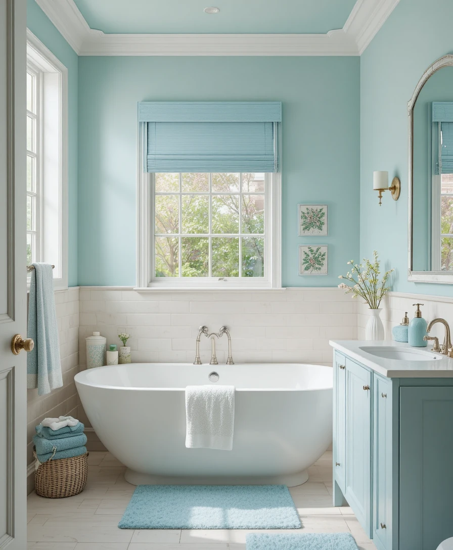
Distributing baby blue bath mats, embroidered hand linens, and glass soap dishes across your vanity surfaces offers a subtle, foolproof pop of color. This layering system is exceptionally effective for keeping dark or windowless guest bathrooms feeling open and balanced. It infuses a refreshing energy that makes every morning routine feel lighter.
19. Pale Peach Walls
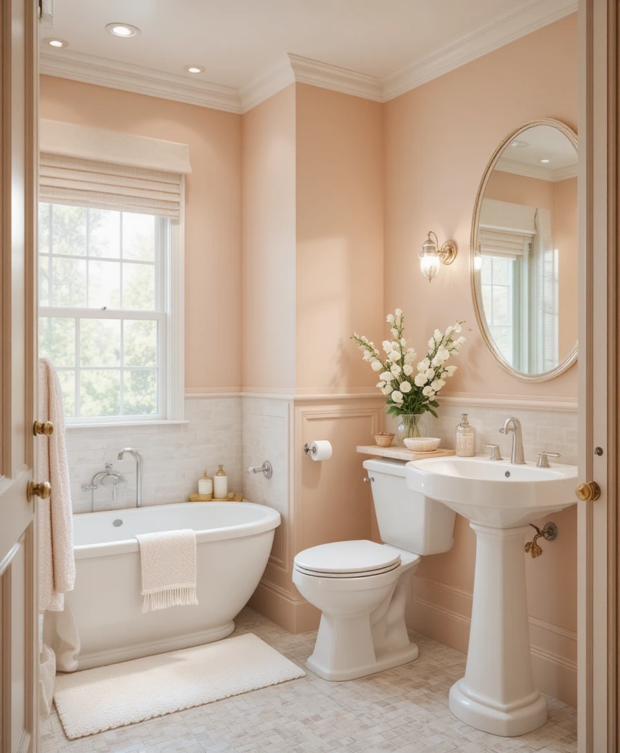
Pale peach walls bring a beautifully warm, soft candlelit glow to your space, even during rainy or overcast winter days. The gentle orange and cream undertones absorb artificial light waves softly, casting an inviting ambiance across your vanity glass. Pair these cozy walls with clean white porcelain fixtures and dimmable lighting systems.
20. Soft Coral Vanity
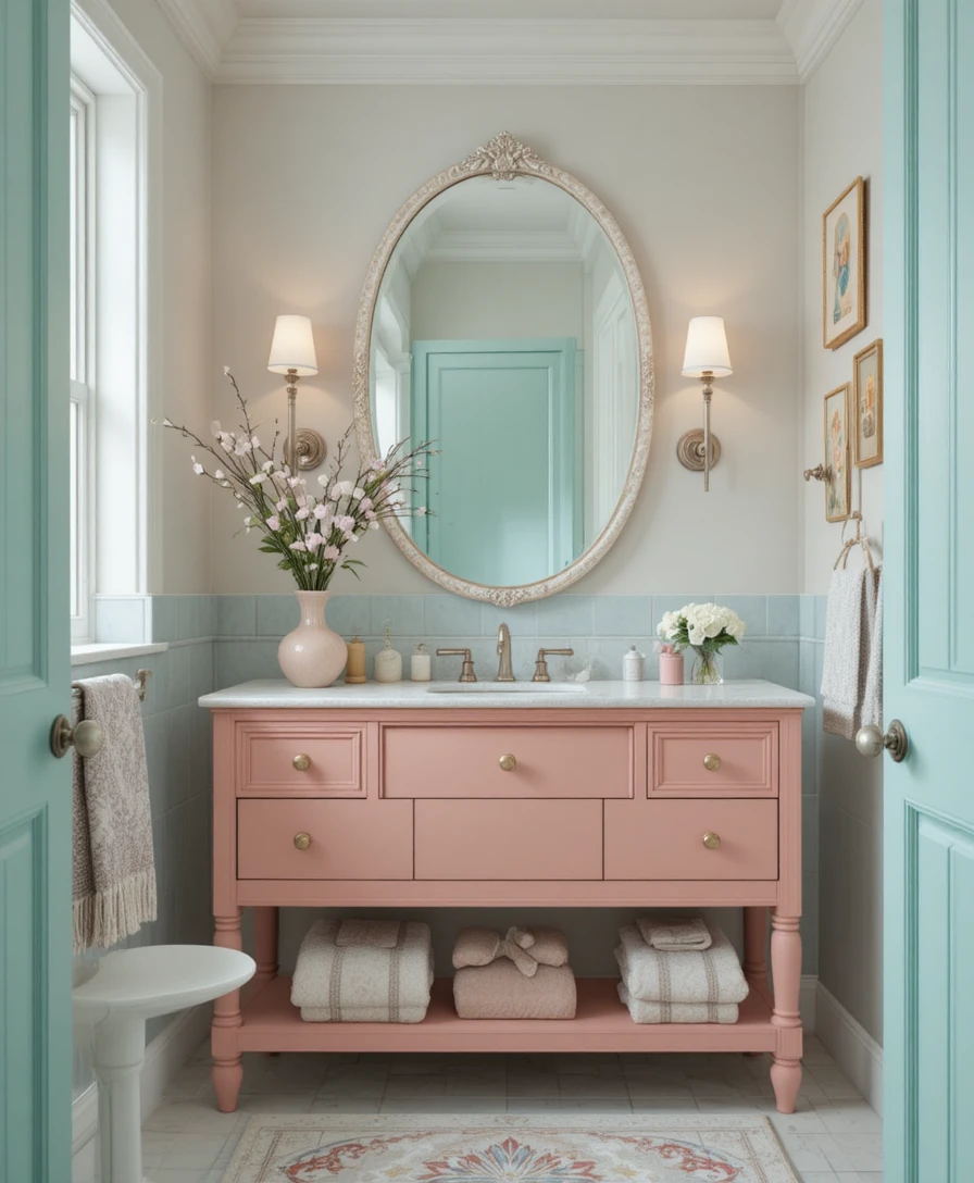
A custom vanity finished in a soft pastel coral lacquer functions as an absolute statement piece while maintaining a gentle, cohesive color palette. The muted coral hue provides an interesting alternative to standard pinks or reds. Pair it with large-format neutral limestone tiles and minimal pastel accessories to keep the focus on the vanity.
21. Mint Green Accents
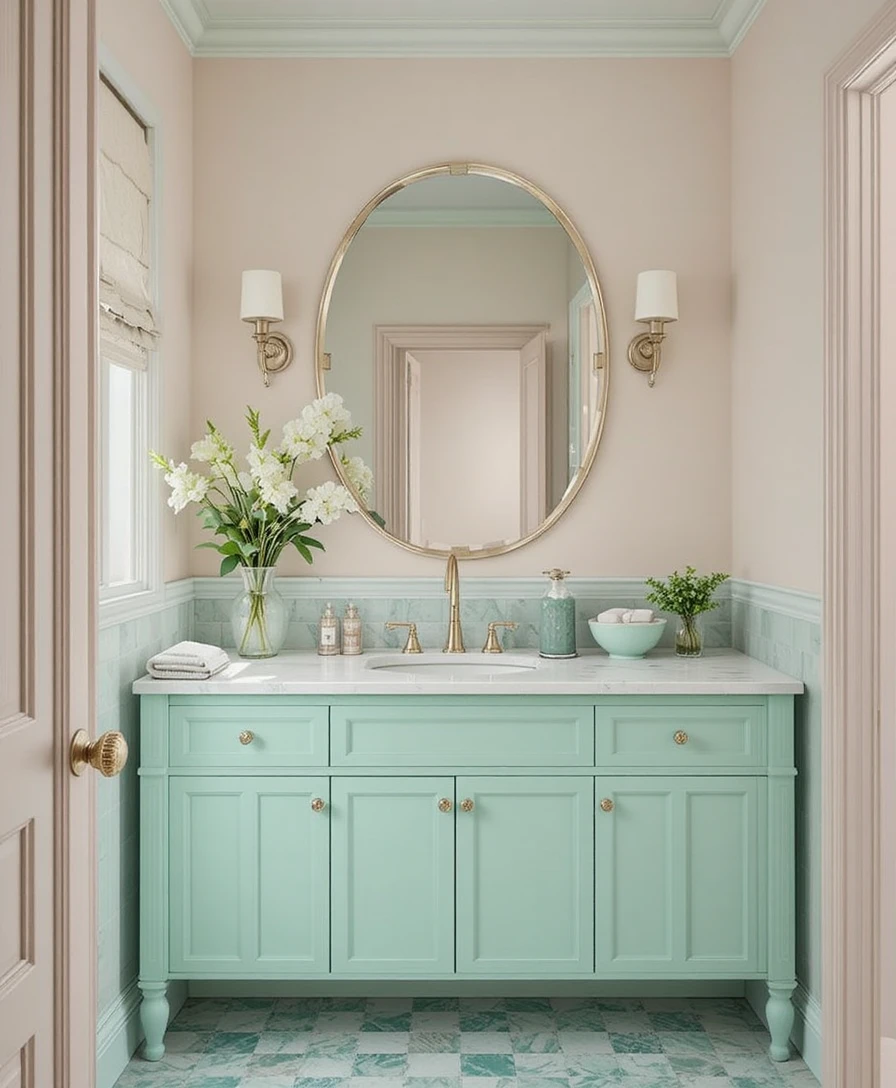
Sometimes, the smallest styling details can make the biggest impact across an open counter layout. Introduce mint green storage bins, ceramic soap dishes, or small glass canisters to tie your color story together perfectly. This curated method introduces an immediate dose of freshness when positioned on classic cream or bright white walls.
22. Pastel Ombre Wall
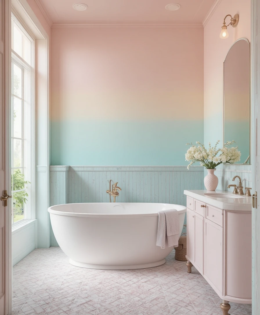
Create an incredible, artistic focal point along your primary plaster wall by executing a customized pastel ombre paint technique. Blend a soft rose pink at the baseboard line, transitioning smoothly into a pale peach or airy lavender as the color reaches the ceiling plane. This gradient expanding technique adds stunning visual interest and unmatched serenity.
Optical Tricks & Pro Styling Hacks
The 60-30-10 Distribution Formula: To maintain perfect visual harmony with pastels, distribute your color percentages intentionally. Dedicate 60% of your layout to your dominant background color (usually your soft pastel wall tone), 30% to your secondary texture layer (white tiles or cabinetry), and restrict the final 10% to small, deliberate accent pops like gold fixtures or green plants.
The Continuous Trim Illusion: Paint your baseboards, window casings, and door trims the exact same color and matte finish as your pastel walls. This technique removes harsh horizontal boundaries, tricking the brain into perceiving your ceilings as much higher and your room footprint as much wider than they actually are.
The High Drapery Placement: Always mount your shower curtain rods and window treatments directly to the ceiling line rather than right above the frames. This simple trick elongates the vertical plane of your room, making a standard compact bathroom feel significantly grander and more architectural.
Scientific Data & Color Psychology
The Neurobiology of Pastel Wavelengths: Environmental design research shows that viewing desaturated pastel color environments drops baseline cortisol production in the human brain. Unlike high-contrast festive colors that stimulate intense brain activity, these calming wavelengths minimize strain on the optic nerves, allowing your parasympathetic nervous system to transition smoothly into a state of relaxation.
Light Reflectance Value (LRV) and Spatial Metrics: According to architectural physics, high-quality pastel paint formulations carry a high LRV rating between 65% and 80%. This means the walls reflect natural light waves softly across the room rather than absorbing them, which bounces brightness into dark corners and makes small layouts feel much larger.
Frequently Asked Questions (FAQ)
Will a pastel color scheme make my primary bathroom look like a nursery?
No, the secret is avoiding ultra-bright candy colors and choosing desaturated, muted pastel tones with gray or brown undertones instead. Layering these elegant colors with premium materials like white marble, natural wood, and brushed gold hardware ensures the final design looks mature and highly sophisticated.
How do I choose the right size area rug for a double vanity layout?
A standard double vanity footprint pairs beautifully with a long runner rug measuring $2′ \times 6’$ or $2.5′ \times 8’$. Position the runner centered along the length of the cabinet base, ensuring a soft, warm landing zone for your feet at both sink stations.
What accent metals pair best with a pastel bathroom color palette?
Satin brass, brushed gold, and champagne copper work beautifully to enhance the inherent warmth of this palette. If your style leans more modern or industrial, incorporate small accents of matte black iron through fixtures or hardware to provide a sharp contrast.
What paint finish is best for high-humidity bathroom environments?
I always recommend using an Eggshell or Satin finish for your primary walls, as they offer a durable sheen that resists moisture and is easy to wipe clean. Reserve Flat Matte for ceilings and low-contact decorative trim to prevent water spotting.
Final Thoughts
Selecting your color foundation using these creative Pastel Bathroom design concepts is an exceptional opportunity to showcase your confidence while building a deeply restorative, personal sanctuary. It proves that modern residential styling doesn’t have to feel clinical, cold, or entirely plain white to look highly sophisticated and polished.
By managing your fabric weights carefully, establishing clear furniture proportions, and layering your lighting tiers with intent, you can easily turn your room into an elegant escape. Take your time testing your paint swatches, trust your design system, and enjoy watching your private world transform.
