

Selecting the perfect neutral paint color is one of the most critical decisions in residential interior design. Throughout my decade of hands-on interior design experience, I have always recommended my clients look past standard, flat whites and builders’ grays.
In 2026, creating a cozy, light-filled sanctuary relies on complex neutrals that adapt dynamically to shifting lighting environments. Sherwin Williams Alpaca (SW 7022) has become a staple across the United States because it strikes an incredible balance between warm beige and cool gray—a true chameleon greige. The primary issue I see with DIY color selections is failing to understand a paint’s undertone behavior under different light sources, which can cause an otherwise beautiful room to look unexpectedly purple or muddy.
To solve this, I utilize a repeatable design system that balances paint chemistry, light exposure, and surrounding textures to ensure your space feels elevated and expansive. These 20 curated applications show how you can use this sophisticated tone to transform your floor plan.
| Design Application | Best Trim Pairing | Optimal Lighting Exposure | Atmospheric Impact |
| Living & Dining Areas | SW Pure White (SW 7005) | South or West-facing windows | Enhances warm, cozy greige undertones |
| Kitchens & Bathrooms | SW High Reflective White | North-facing or artificial LED | Sharp, clean, modern, and spa-like |
| Hallways & Bedrooms | SW Alabaster (SW 7008) | East-facing or layered ambient | Soft, restful, balanced, and inviting |
Tools & Materials You Need
Before opening a single paint can or applying tape to your baseboards, establishing your technical specifications prevents uneven coverage and finish failures:
Paint Formula Specification: Sherwin Williams Emerald or Duration Interior acrylic latex in a Satin or Eggshell finish for wall surfaces.
Trim and Baseboard Polish: Semi-Gloss or High-Gloss oil-based or premium waterborne urethane alkyd enamel formulas for durable contrast lines.
Roller Nap Depth Standard: A premium $3/8\text{“}$ to $1/2\text{“}$ microfiber roller nap to achieve a smooth texture on standard residential drywall.
Lighting Temperature Target: High-efficiency LED bulbs calibrated
Detailed Step-by-Step Guide: 22 Foyer Decoration Ideas
Core Living Spaces and Restful Sanctuaries
1. Living Room That Feels Warm Yet Modern
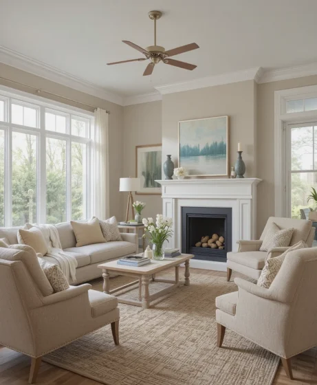
Using Sherwin Williams Alpaca as your primary envelope provides a welcoming, grounded base that bridges classic warmth and modern minimalism. Because this color contains subtle taupe and violet undertones, it shifts effortlessly throughout the day as natural sunlight changes. I always recommend my clients pair it with clean white baseboards and light oak timbers to maintain an airy, expansive visual horizon.
2. Bedroom With a Soft Hotel Feel
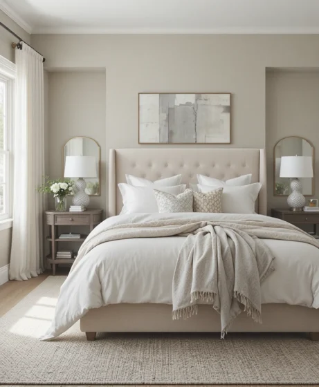
Your bedroom should act as a personal restorative retreat from the frantic pace of daily life. Coating the walls in this gentle greige creates an enveloping, quiet environment that encourages rest. Layer the bed with high-thread-count white linens, heavy waffle-weave cotton throws, and textural linen pillows to build a beautiful sanctuary.
3. Kitchen Walls That Complement White Cabinets
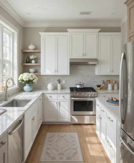
High-contrast kitchens can sometimes feel uninviting or clinical if the transitions are too sharp. Applying this neutral hue to your open wall surfaces softens the gap between bright white upper cabinets and cool marble countertops. It introduces an organic warmth that makes the kitchen feel integrated with the rest of the home.
4. Bathroom That Feels Spa Inspired
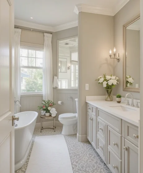
In high-humidity washrooms, flat white walls can look cold and show water spots easily. This balanced shade pairs beautifully with natural stone tiles and brushed nickel hardware, casting a soft glow. It transforms a compact bathroom footprint into an intimate, spa-like zone where you can easily unwind.
5. Hallways That Feel Brighter and Wider
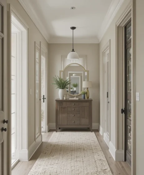
Enclosed corridors often suffer from a lack of natural window light, making them feel tight and dark. Because this paint features a highly functional Light Reflectance Value (LRV) of 57, it bounces ambient lighting paths down the corridor effectively. This characteristic fakes width, turning a boring pass-through path into an inviting transition zone.
Shared Experiences and Focused Backdrops
6. Dining Room With Subtle Elegance
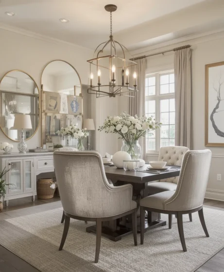
Dining rooms require a color foundation that looks exceptional under dim, intimate evening lighting. When paired with a dark walnut dining table and an overhead brass statement fixture, this paint behaves like a velvety backdrop. It maintains a sophisticated aesthetic without competing with your furniture shapes or linen draperies.
7. Perfect Backdrop for Gallery Walls
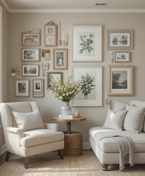
If you are an art lover, your walls should serve your collection rather than distract from it. The balanced gray-beige profile acts as a gallery-level background that highlights the true colors of your oil paintings and monochrome sketches. It provides enough depth to make white framing mats pop cleanly away from the drywall surface.
8. Home Office That Encourages Focus
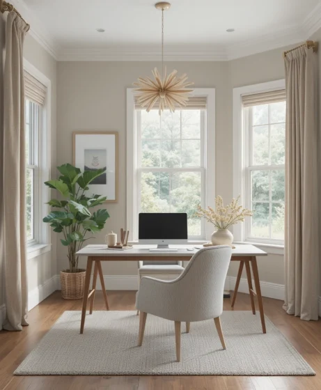
Bright, saturated wall colors can trigger visual fatigue during long video calls and deep-focus work hours. This neutral tone reduces sensory stimulation, setting up a calm, organized workspace that supports daily productivity. It coordinates beautifully with matte black desk accessories and rich leather office chairs.
9. Entryway That Feels Inviting
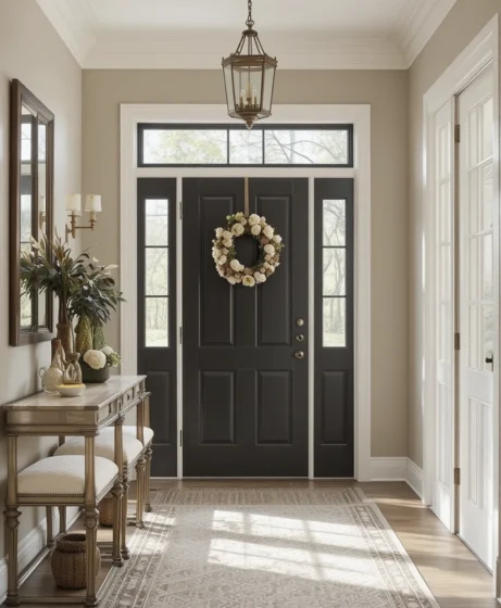
Your entry path establishes the initial emotional impression your home makes on guests. Applying this inviting hue at the threshold coordinates easily with your exterior landscape tones, drawing visitors inside. It sets up an immediate sense of home safety that transitions smoothly into adjacent open-concept rooms.
10. Pairs Beautifully With Natural Wood
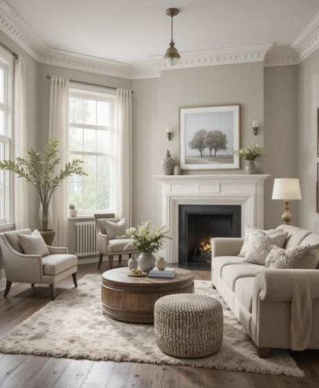
From honey-toned white oak flooring planks to deep, chocolate-colored walnut cabinetry, wood grains glow against this paint. The color reacts favorably with natural timber tannins, highlighting the organic knots and rings of your furniture. This interaction grounds your space, making it feel deeply authentic.
Flow Continuity and Architectural Contrast
11. Ideal for Open Floor Plans
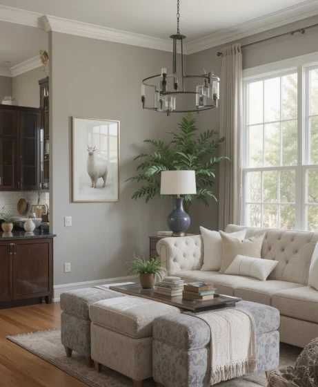
Modern architectural configurations often link the kitchen, dining, and living zones into a singular continuous hall. Using a single, steady neutral across the entire open footprint prevents messy transitions and visual breaks. This color supplies reliable continuity without looking repetitive, sterile, or flat.
12. Accent Wall That Feels Subtle
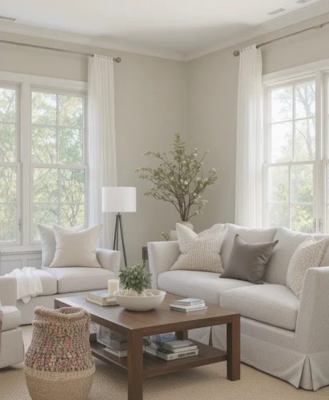
When people think of an accent wall, they often mistakenly choose a loud, high-contrast jewel tone that slices the room in half. Instead, try applying this subtle shade over a wall featuring custom vertical wood slats or geometric panel molding. The color difference remains soft and sophisticated while emphasizing your structural millwork.
13. Works Well With Black Fixtures
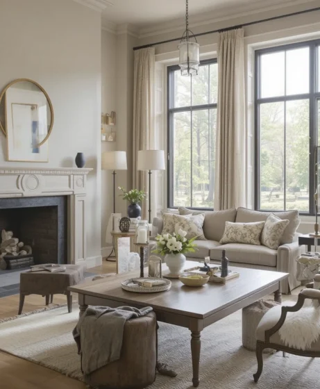
If your interior architecture relies on industrial accents, this greige provides the perfect canvas. The soft charcoal pigments hidden inside the paint matrix soften the contrast against matte black steel curtain rods, window sashes, and lighting stems. This relationship keeps your modern details looking sharp but completely livable.
14. Complements Soft Textiles and Layers
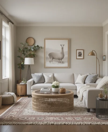
Achieving a rich, professional design finish relies on building up a diverse family of interior materials. This paint acts as a reliable foundation that welcomes heavy wool area rugs, chunky knit throws, and linen window drapes. It absorbs the textures of your fabrics, reinforcing a cozy, lived-in aesthetic.
15. Nursery That Feels Calm and Gentle
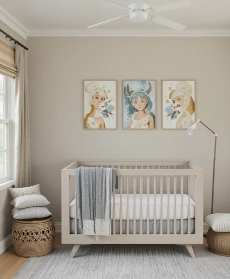
Avoid bright, overstimulating primaries in favor of a soothing space for your little ones. This soft tone builds a peaceful backdrop that can easily grow along with your child’s changing style over the years. It plays beautifully with pastel accents, light birch cribs, and soft woven storage bins.
Curated Coordinates and Enduring Styles
16. Guest Room That Feels Hotel Inspired
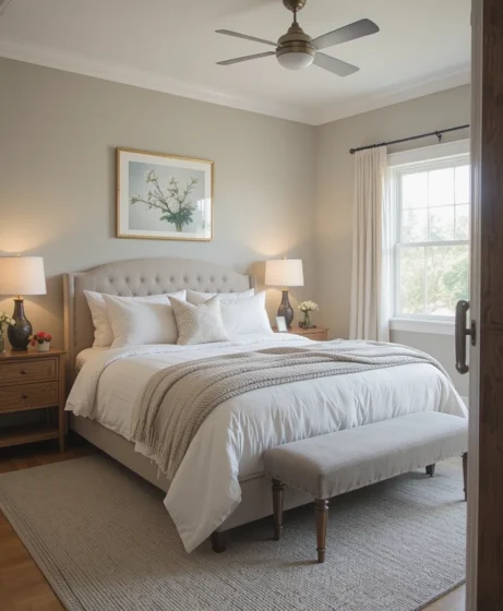
Welcome your traveling guests with a refined hospitality experience right inside your spare room. Combining this hue with crisp white sheets, woven duvet covers, and low-wattage warm bedside lamps builds a relaxing retreat. It feels universally clean, comforting, and thoughtfully designed.
17. Pairs Beautifully With Black Accents
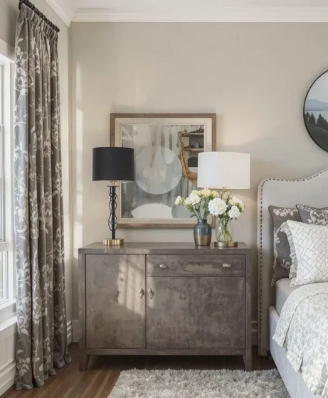
For contemporary design lovers, integrating crisp black lines updates a traditional home instantly. Use thin black metal frames, dark iron cabinet pulls, or slender floor lamps against the walls. The contrast stays intentional and clean without creating a harsh, institutional look.
18. Works Perfectly With Warm Metallics
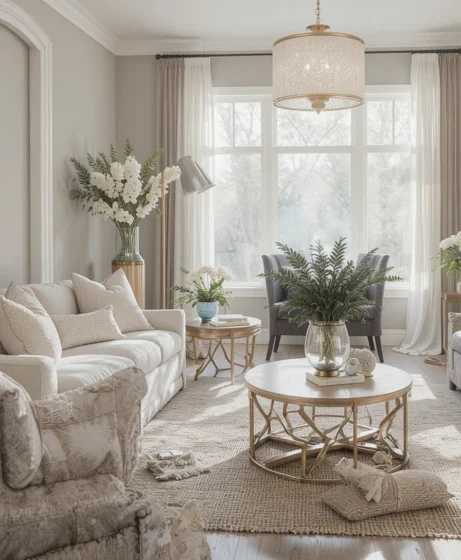
Unlacquered brass, brushed gold, and antique bronze fixtures add incredible character to a modern interior layout. This greige highlights the reflective properties of warm metal finishes, catching light points gracefully. This pairing works exceptionally well across vanity faucets, light bases, and decorative trays
19. Ideal for Minimalist Decor Lovers
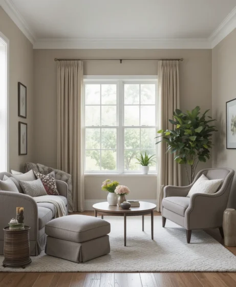
If your personal style centers on edited spaces and low clutter, your paint selection carries extra responsibility. This paint delivers enough internal shadow and pigment complexity to keep a minimalist room from looking abandoned. It fills empty rooms with quiet, intentional warmth using color theory alone.
20. A Timeless Whole Home Color Choice
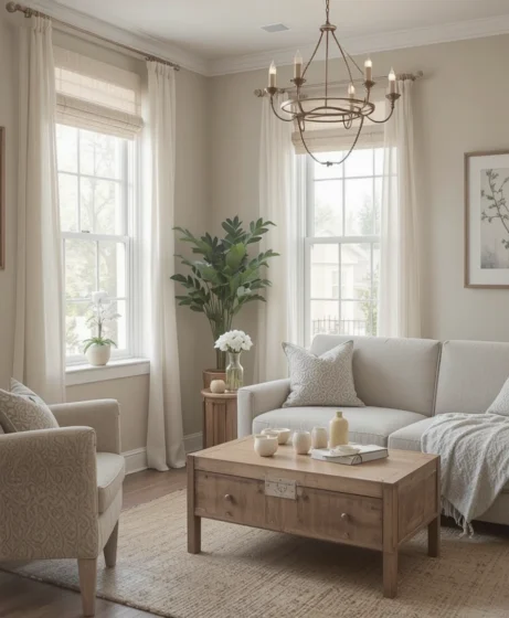
Committing to a single, whole-house color palette streamlines your home maintenance while creating a unified design flow. This paint transitions from sunny south-facing dens to low-light basement media rooms with ease. It stands as a dependable choice that coordinates with shifting design trends for years to come.
Optical Tricks & Pro Styling Hacks
To make sure your selected neutral functions at its highest level, use these professional interior physics rules to manipulate your room’s proportions:
The Unified Trim Extension: If you are trying to make a small room with eight-foot ceilings look grand, paint your baseboards, crown molding, and window casings in the exact same color as the walls, but swap the sheen to Semi-Gloss. This technique removes the harsh breaking lines of white trim, tricking the eye into perceiving a taller wall plane.
The Warmth Correction Secret: Because this paint features a slight taupe-violet undertone, it can sometimes pull cool or slightly lavender in northern daylight. To balance this out, use warm 2700K lighting sources across your table lamps to draw out the cozy beige side of the paint.
The Ceiling Height Fake: Paint your ceiling in a matching neutral color but diluted by $50\%$ with pure white paint base. This slight tonal change maintains color continuity across the room while visually lifting the ceiling, making the entire room feel light and open.
Scientific Data & Color Psychology Parameters
The selection of our wall coatings alters our biological resting states far more than basic decoration preferences suggest. According to data from environmental psychology and spatial lighting physics:
The Neurological Value of Low-Contrast Neutrals: High-gloss pure white walls keep the human eye in a state of constant focus adaptation due to high light bounce, which can cause subtle mental fatigue over long periods. Introducing a soft greige with a balanced Light Reflectance Value (LRV) of 57 absorbs scattering light rays while softening contrast lines. This reduces eye strain and helps lower resting heart rate indicators, fostering a calmer, more relaxing social space for family conversation after a busy day.
Furthermore, balancing warm and cool paint pigments provides an organic material counter-weight that stabilizes our subconscious perception of the room’s temperature.
Frequently Asked Questions (FAQ)
Is Sherwin Williams Alpaca a warm or cool color?
This color is a highly balanced, complex greige neutral. It sits directly on the border between warm and cool, leaning warm beige in sunny south-facing rooms and shifting to a cool gray with a hint of taupe in north-facing light.
What are the best coordinating trim colors for SW Alpaca?
I always recommend pairing it with SW Pure White (SW 7005) for a clean, current contrast line, or choosing SW Alabaster (SW 7008) if you want a softer, traditional warm look across your baseboards and casings.
Does this paint color show purple undertones?
Yes, it can occasionally reveal a soft taupe-violet undertone in cool, northern natural light or under high-temperature blue LED bulbs. You can easily manage this by utilizing warm 3000K lighting sources inside the space.
Final thoughts
A beautifully balanced home environment is never achieved by copying a basic showroom trend—it is built by mastering the interactions of light, scale, and material harmony. Selecting a dependable, adaptable neutral like this refined greige provides an efficient baseline that pulls your furniture collections together while softening the hard lines of modern architecture.
By supporting your walls with correct lighting choices, natural wood textures, and clean trim alignments, you can easily transform basic drywall into a highly custom design highlight. Trust your eye for visual balance, respect your home’s natural light paths, and enjoy your beautiful, hardworking new sanctuary for years to come.
